What's Your Favorite Album Cover & Why.
Posted by: Quad 33 on 22 December 2012
I have been thinking about starting this thread for sometime, So here goes.
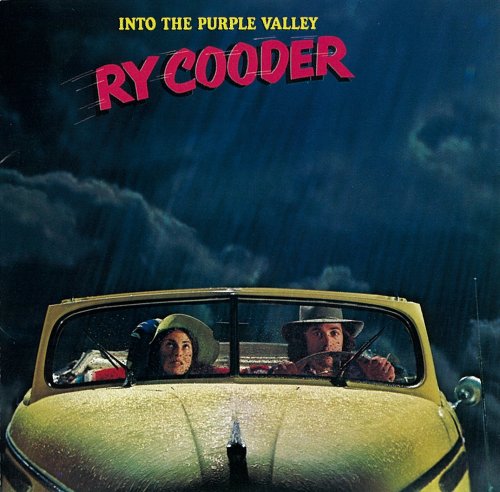
When I first saw this cover, which is a gate fold. The inside picture of Ry and the girl, with the top down on the car, sat in the sun made me want to move to California ASAP.
Graham.

because it was the first LP I bought with my hard earned cash, it depicted something different was happening out there, the music said the same. I still have it hanging on my study wall in pride of place.
Richard
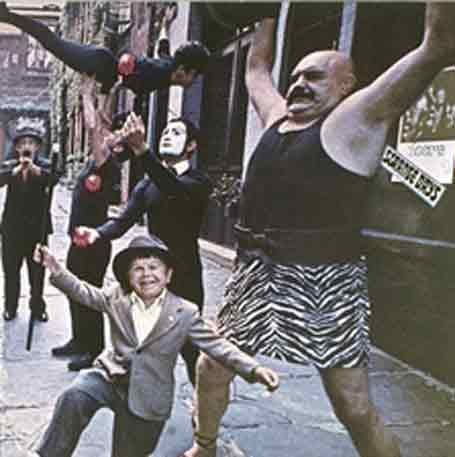
I'm sure we have done this before:
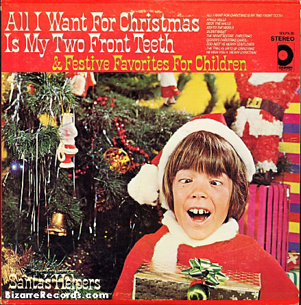
C'mon, it's Xmas! I'll come up with something better in the new year. Have a good one!
KR
Tony
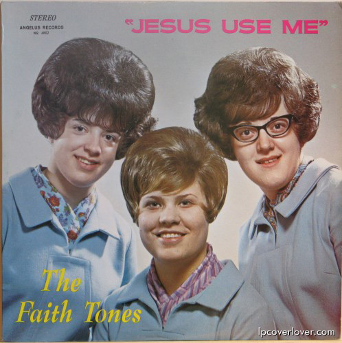
This is one of them for sure...

Love many of Alex Steinweiss covers he did for Columbia and RCA. His sense for typography, colours and organisation of elements create wonderful arresting visuals.


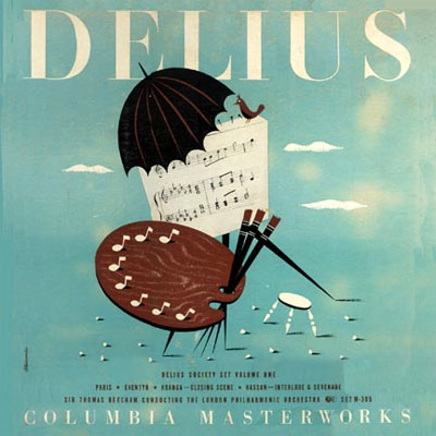
I also like these London's bright coloured corny covers as well as Kodachrome look mug shot with a *man eating* lipstick of the 50s. They looks so dated but sort of cool now.


Then I also like something with minimum colours. Michelangeli cover is done with silver/blk duotone. I love the monochromatic Blue Note covers, too. There are just so many good ones.
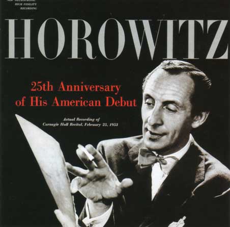



And Love these Angel Records covers for excellent typography and beautiful type setting. They lavished on binding and paper, too.


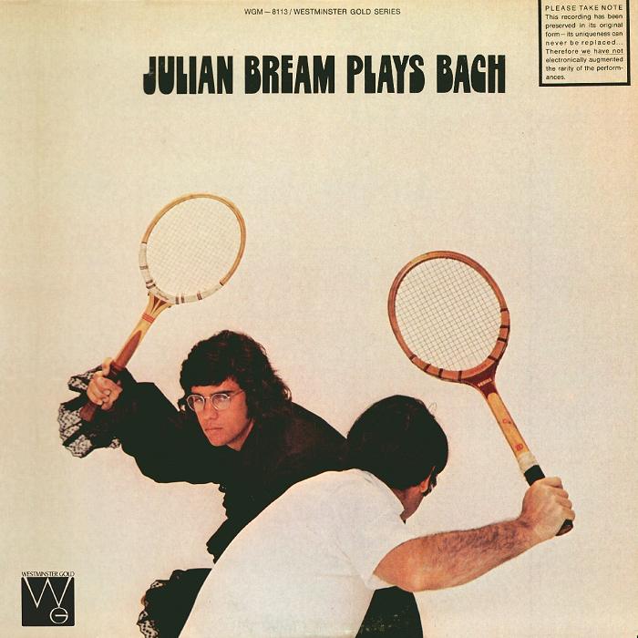
And these wacky Westeminster Gold covers are amusing. ( albeit they sound horrible )
Wonder what the art director was smoking.


I also fancy Saul Bass Designs.


How do you post a flippin album cover from an ipad?

Love many of Alex Steinweiss covers he did for Columbia and RCA. His sense for typography, colours and organisation of elements create wonderful arresting visuals.


I also like these London's bright coloured corny covers as well as Kodachrome look mug shot with a *man eating* lipstick of the 50s. They looks so dated but sort of cool now.


Then I also like something with minimum colours. Michelangeli cover is done with silver/blk duotone. I love the monochromatic Blue Note covers, too. There are just so many good ones.


And Love these Angel Records covers for excellent typography and beautiful type setting. They lavished on binding and paper, too.


And these wacky Westeminster Gold covers are amusing. ( albeit they sound horrible )
Wonder what the art director was smoking.


I also fancy Saul Bass Designs.


Great covers there Kuma. The Steinweiss ones are really beautiful. I notice there are a number of books available on him - I might have to invest. ![]()
I love album artwork - a 12 inch square canvas gives a good designer a great space in which to work. Most of my fave covers have one quality in common, which is simplicity.
This isn't an album (it's a 12" single) but is my all-time favourite, designed by Peter Saville in 1983. A die-cut sleeve with a silver-grey inner, designed to look like a floppy disc (at the time, cutting-edge tech):

Saville has designed a number of other great album covers, especially for Factory. His two specialities were minimalism and a playful ransacking of art history...
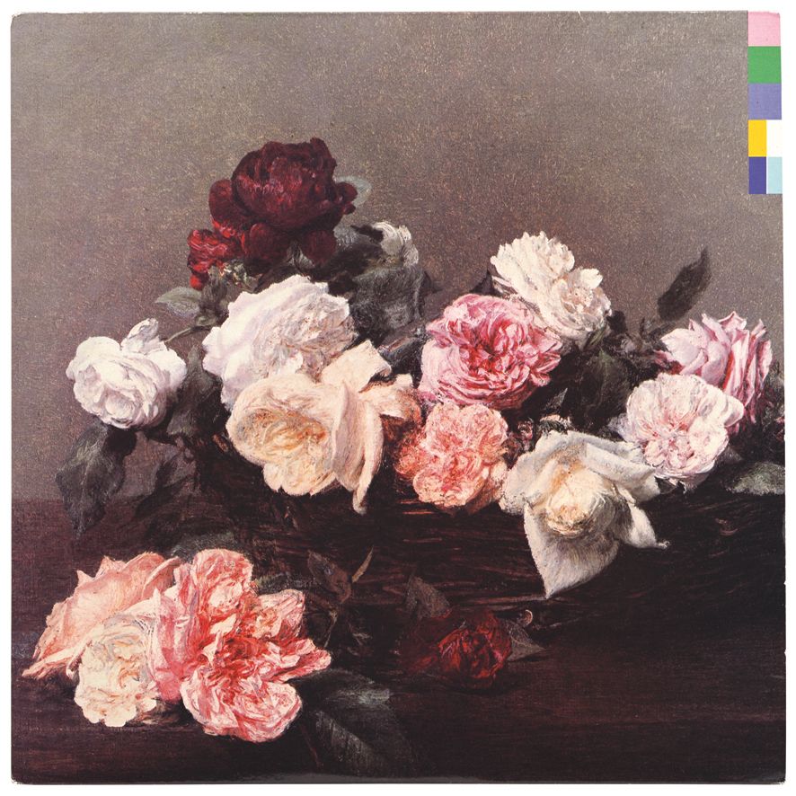
New Order's PC&L (that's a Fantin-Latour on the cover):
Here, on New Order's debut album, he references a 1913 Futurist poster by Fortunato Depero. Oroginally it was printed on a kind of "sugar" card, which added texture. I love the simplicity, the font and use of colour. The album's original catalogue number was FACT 50 - you can see the "F" and an "L" for 50.

The original cover for Kraftwerk's "Autobahn" (1974) was created by Emil Schult, but this UK version, created by a nameless hack in Phonogram's in-house marketing department, is far superior. Its beautiful simplicity provides a wonderful visual counterpoint to the music.

This is such a cliche, but it really, really works. It's breathtaking in its simplicity, and has now become iconic - it's probably the most famous album cover ever (with the possible exception of Sgt Pepper).
Created by Hipgnosis (Storm Thorgerson, Aubrey Powell), with George Hardie providing the graphics. Thorgerson's attempts to re-envision this art for various reissues of DSOTM (1994, 2003 etc) have been tacky in the extreme. You simply can't improve on such a brilliant idea.
Isn't it odd how that whenever you see a prism, you hear the click and whirr or cash registers?

You know, in thinking about this thread, it occurred to me that there are a couple that we have seen so often that we just take them for granted, but are great examples of album cover artwork:


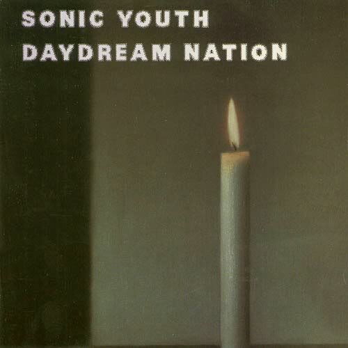
One of THE great albums of the eighties (1988). The band chose a painting by the artist Gerhard Richter ("Kerze") which is completely unrelated to the album's content.
But it just works.
In 1979, The Durutti Column released their debut album "The Return of The Durutti Column" (FACT 14). The initial copies came in a stamped sandpaper sleeve (glued together by members of Joy Division in Tony Wilson's flat). Designed by Peter Saville, it was Wilson's idea of a joke - if you kept it near your other records, it would destroy them!

In 1980, it was reissued in a more conventional sleeve. Designed again by Saville, the pictures are by Raoul Dufy (1877 – 1953). The embossed, textured card on which the cover is printed is a pleasing touch:

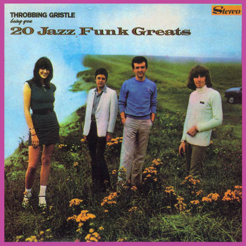
This, from 1979, is just really funny. There's a fabulous mismatch between the musical content of this TG album and the photograph and its styling.
From '76. One of the best debut albums ever. Another example of the power of keeping it simple: just a stark, monochrome Robert Mapplethorpe photo. Hugely effective.
Patti looks like a female Keith Richards (and I mean that in a good way).

I love album artwork - a 12 inch square canvas gives a good designer a great space in which to work. Most of my fave covers have one quality in common, which is simplicity.
This isn't an album (it's a 12" single) but is my all-time favourite, designed by Peter Saville in 1983. A die-cut sleeve with a silver-grey inner, designed to look like a floppy disc (at the time, cutting-edge tech):

Got it on the first day of release!!!!
Treasured possession status assured.
Jono

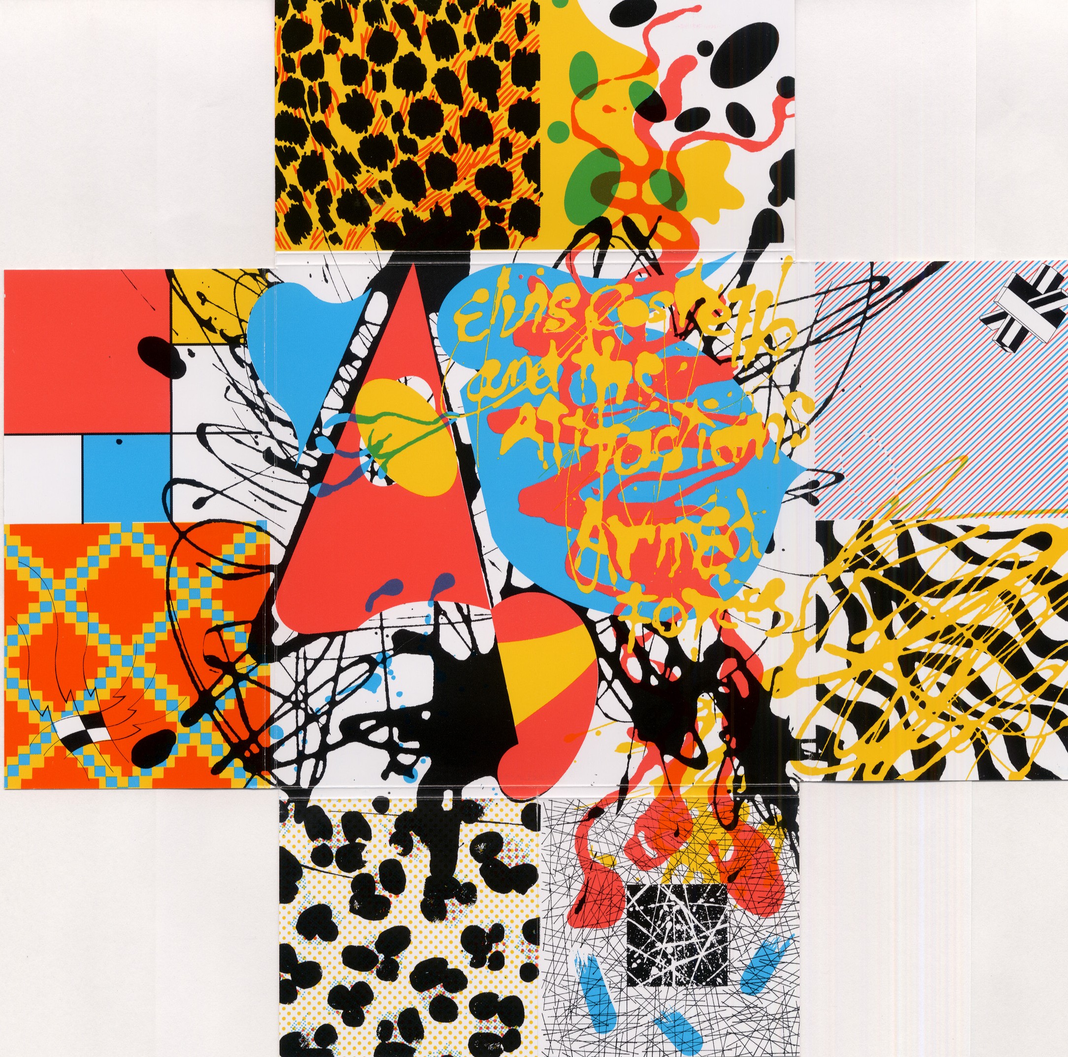
For the checker plate finish it nothing else.

with the fold out cover thus.....
Jono
I love album artwork - a 12 inch square canvas gives a good designer a great space in which to work. Most of my fave covers have one quality in common, which is simplicity.
This isn't an album (it's a 12" single) but is my all-time favourite, designed by Peter Saville in 1983. A die-cut sleeve with a silver-grey inner, designed to look like a floppy disc (at the time, cutting-edge tech):

Got it on the first day of release!!!!
Treasured possession status assured.
Jono
Me too! March 11th, 1983 from the Virgin Megastore on Oxford St...
I dislike this artist, and I can't stand this album, but I think this is a great cover - striking and very simple, a great B&W composition:

One of THE great albums of the eighties (1988). The band chose a painting by the artist Gerhard Richter ("Kerze") which is completely unrelated to the album's content.
But it just works.

My favorite restaurant in Chicago has one of the candle paintings from Richter hanging in the entranceway. It's a great experience. I also love the first song on this album, Teenage Riot
