What's Your Favorite Album Cover & Why.
Posted by: Quad 33 on 22 December 2012
I have been thinking about starting this thread for sometime, So here goes.
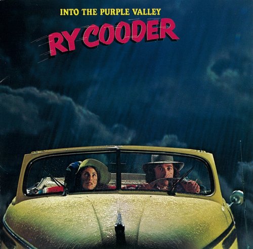
When I first saw this cover, which is a gate fold. The inside picture of Ry and the girl, with the top down on the car, sat in the sun made me want to move to California ASAP.
Graham.
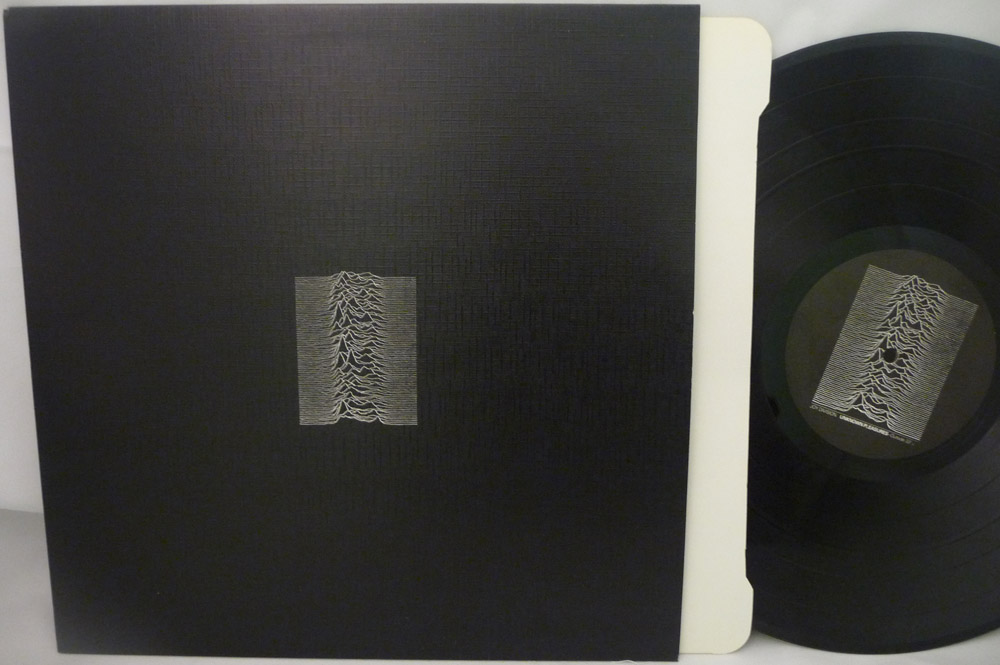
The greatest debut ever, and one of the best sleeves ever (FACT 10, 1979). Bernard Sumner found the front image, the signals from a pulsar, in an astronomy book. Saville did the rest. What really makes it work is the minimalism, and the texture. Although it's a very abstract design, it is a perfect description of the music within - cold, steely, stark, dark.
It takes confidence for a band NOT to put their name on the front of their debut album...
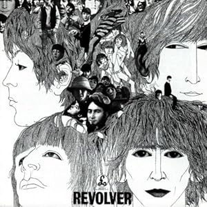
Drawn by Klaus Voormann; artist and bassist on several of the post-Beatle solo LPs.
The Abbey Road cover is a close second favorite to this.
The greatest debut ever, and one of the best sleeves ever (FACT 10, 1979). Bernard Sumner found the front image, the signals from a pulsar, in an astronomy book. Saville did the rest. What really makes it work is the minimalism, and the texture. Although it's a very abstract design, it is a perfect description of the music within - cold, steely, stark, dark.
It takes confidence for a band NOT to put their name on the front of their debut album...

Once a design classic, always a design classic. My daughter's school friends still want the t-shirt!
Jono


Just in case you've ever wondered who some of those people are.
Sensational use of bold graphics

Like Blue Note, Impulse! was a jazz label with superb covers.
I love the use of vertical elements and bold colour against black on this1960 Kai Winding and JJ Johnson album:


I've picked up this album due to its striking minimum coloured cover photo.
I always thought this back of the album shot was cool:

I also bought this album strictly based on the cover art. ( Roger Dean )
I hurried home and put this on and only to discover the record had an off-centre hole so I had to go all the way back to the city and replace it.
Same along the line, but H.R. Giger's work had a stronger impact on me complete with a cool die cut.

I've picked up this album due to its striking minimum coloured cover photo.
I was expecting the White Album ![]()

I agree that conceptually this was unique and first of its kind.
Now, the idea has been stolen so many times, it somehow doesn't stand out as much.

I agree that conceptually this was unique and first of its kind.
Yes, the follow-up to Sgt Pepper, the most expensive and perhaps elaborate album cover to that time. I bet the bean counters were happy with the lads' generic selection.
Nice to see an embossed cover. In the US those were replaced with light gray print by the time I bought mine.
Does the new 2012 reissue have the embossing?
Does the new 2012 reissue have the embossing?
The US CD remasters (2009) were nicely embossed. Haven't got the vinyl, but I'm assuming it does.
AH cool thanks.
Got the Sgt. Pepper 2012 reissue ( US pressing ). I havene't opened it yet but the printing quality seems to be decent.
Got the Sgt. Pepper 2012 reissue ( US pressing ). I havene't opened it yet but the printing quality seems to be decent.
I've read the packaging is nice. Have you seen the whole discussion here regarding differences in the pressing quality of US vs Europe?
https://forums.naimaudio.com/di...nt/19306559077211069
I not sure I'm going to get the remastered vinyl, but if I do, I'll pay more to get the European pressing.
Where are you located?
I am in the US.
From what I have read so far, US pressings are made at Rainblowbow plant which isn't very promising.
Fremer is doing the follow up report but I reacall that some US titles are pressed at the RTI.
I am not a collector and not much of Beatle-mania so I've no plan to spend an extra for shipping from the UK. All told, from the AmazonUK, the cost is about 35 bucks which isn't terrible ( seems to be a going price for a decent reissue now a days ) but for me, this is still digital. So even the UK pressing can't be *that* good.
I am, however, going to get a mono White Album. ![]()
but for me, this is still digital.
My feelings exactly! Though I think the original tapes were not in condition to use directly, so had to be done. The vinyl is at higher resolution than CD, but still digital.
Looks like you are more of a classical person, so just enjoy the individual Beatles LPs you like. Cheers!

Artwork by Neon Park.
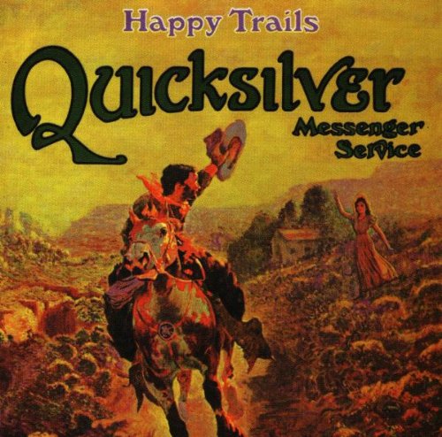
Both these album have iconic covers imo.
Graham.
Another favourite cover, again from Factory and Peter Saville (working under his Grafica Industria nom de plume). This is section 25's "Always Now" from 1981 - the sleeve was unbelievably expensive (Factory also had to pay a huge royalty for the use of the marbled paper) and the album sold about 5,000 copies IIRC.
Front:



I love this piece of optimistic 60s jazz futuro-kitsch on Atalantic (1966), from vibes player Dave Pike:

Kevin,
Some nice postings. Just shows how the industry saw the album covers as real works of art nd gave ome thing to the hole experience, not just a cover for the vinyl.
Makes me recall happy days of old with the black stuff
Kevin,
Some nice postings. Just shows how the industry saw the album covers as real works of art nd gave ome thing to the hole experience, not just a cover for the vinyl.
Makes me recall happy days of old with the black stuff
Cheers Paul
Agree 100% - the album cover will soon be a lost art, sadly, shrunk to a 150 x 150 pixel display on a streamer's display.
Here's another favourite - brilliantly simple (in case nobody knows, it's Atom Heart Mother by the Floyd, 1970) but very powerful. On a 12 x 12 canvas, it still looks great:

Another great and innovative album cover, except that the zipper used to scratch the back of the album next to it on the shelf!

Kevin,
Some nice postings. Just shows how the industry saw the album covers as real works of art nd gave ome thing to the hole experience, not just a cover for the vinyl.
Makes me recall happy days of old with the black stuff
Cheers Paul
Agree 100% - the album cover will soon be a lost art, sadly, shrunk to a 150 x 150 pixel display on a streamer's display.
Here's another favourite - brilliantly simple (in case nobody knows, it's Atom Heart Mother by the Floyd, 1970) but very powerful. On a 12 x 12 canvas, it still looks great:

Kevin, isn't there a similar image on a blink 182 album?

