Naim Forum photo al***
Posted by: count.d on 18 January 2004
1.
[This message was edited by count.d on SUNDAY 18 January 2004 at 12:42.]
[This message was edited by count.d on SUNDAY 18 January 2004 at 12:42.]
Posted on: 03 February 2004 by Haroon
quote:
Originally posted by DJH:
Great stuff, Haroon. I like the spinning prayer wheels image in particular. The image but one after that - is that a temple incense burner, or an industrial extruding machine?
Its a huge burner, its the one infront of the jokang (main temple) in lhasa.
Posted on: 04 February 2004 by Shayman
Obligatory close-up of something symetrical in nature shot I took this weekend. Looks great before reduction to 50k jpeg I think
Jonathan
Jonathan
Posted on: 04 February 2004 by DJH
Shayman - is that the Giant's Causeway?
Posted on: 04 February 2004 by Dan M
Haroon, I agree, that pic of spinning prayer wheels is great. To get the blurred effect, I imagine you needed a longish exposure. Was that intentional?
Dan
Dan
Posted on: 05 February 2004 by Shayman
Well spotted DJH. Giant's Causeway it is. Great place for a bit a amateur photography. Why the need for the bus though is anyones guess. It can only be half a mile from the road. You could probably even do it in a wheelchair.
Jonathan
Jonathan
Posted on: 05 February 2004 by DJH
Last one for a while ... any comments welcome.
Cheers
David
Cheers
David
Posted on: 05 February 2004 by matthewr
"any comments welcome"
You're gonna get busted by the cropping police
You're gonna get busted by the cropping police
Posted on: 05 February 2004 by DJH
Maybe, but there is next to no cropping when the image is taken with a 6x12 back on a 4x5 camera.
Posted on: 05 February 2004 by Haroon
quote:
Originally posted by Dan M:
Haroon, I agree, that pic of spinning prayer wheels is great. To get the blurred effect, I imagine you needed a longish exposure. Was that intentional?
Dan
Most definately was intentional - movement of life (the people going around and the wheels), prayer, ascendance (into the white lights) were all part of it. The people of Tibet really did move me spiritually, first time in my life like that. Don't remember the exposure, but wasnt that long as it was handheld.
Posted on: 05 February 2004 by Haroon
DJH great pic, at first i thought hey it should be landscape rather than portrait, due to the outcrop of land on the left cutting in on the mountains .. makes my eye think where the rest? But im coming round to it as i notice the pebbles at the front and my eyes get led to the mountains. good stuff, good stuff 
Posted on: 06 February 2004 by Berlin Fritz
This thread is just one big inedible scan after another, Brrp, and there aren't enough of them !
Fritz Von Florencesaysit'sthattimeagaininnit
Fritz Von Florencesaysit'sthattimeagaininnit
Posted on: 10 February 2004 by Joe Petrik
This is more a test shot with some film Vuk highly recommended a while back, but the picture is growing on me.
Joe
Nerd info: Nikon F3HP, 35mm f/1.4 probably at f/4, Agfa Scala 200x, and a bit of sepia toning in Photoshop
[This message was edited by Joe Petrik on TUESDAY 10 February 2004 at 23:12.]
Joe
Nerd info: Nikon F3HP, 35mm f/1.4 probably at f/4, Agfa Scala 200x, and a bit of sepia toning in Photoshop
[This message was edited by Joe Petrik on TUESDAY 10 February 2004 at 23:12.]
Posted on: 10 February 2004 by Joe Petrik
Alex,
Thanks. It must be the B&W film. I took an almost identical shot with colour film and it left me cold, whereas this one makes me feel cold.
Joe
Thanks. It must be the B&W film. I took an almost identical shot with colour film and it left me cold, whereas this one makes me feel cold.
Joe
Posted on: 11 February 2004 by andy c
Hey stumpy thats a cracking picture. Whats its normal size - does it look good in a frame?
andy c
andy c
Posted on: 29 February 2004 by DJH
Thought I'd resurrect this thread with another landscape - no cropping either;
Posted on: 29 February 2004 by matthewr

Posted on: 29 February 2004 by count.d
Two nice shots.
Posted on: 16 March 2004 by Mike Hanson
Pics from a newbie:
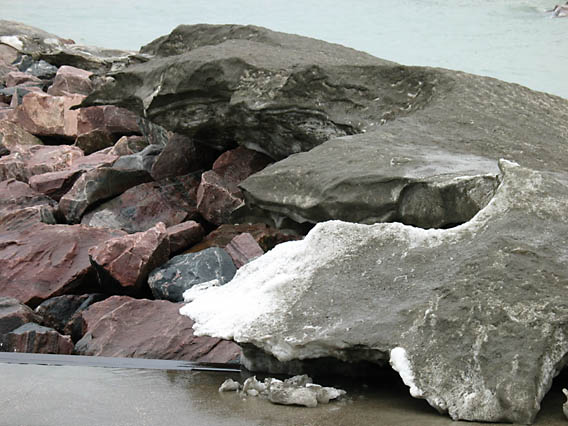
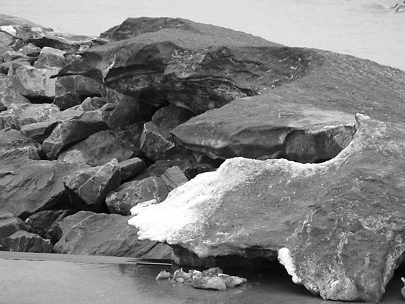
I'm not sure whether I like this one more in Color:
Or B&W:
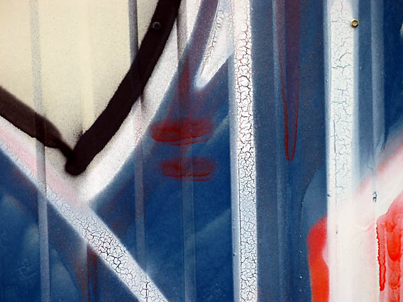
Here's my homage to Vuk:
BTW, these were taken in the Beaches in Toronto.
-=> Mike Hanson <=-
P.S. Nerd info: Shots were taken with a Canon PowerShot G3 Digital, and tweaked just a bit with PS-Elements.
[This message was edited by Mike Hanson on Tue 16 March 2004 at 22:24.]
I'm not sure whether I like this one more in Color:

Or B&W:

Here's my homage to Vuk:

BTW, these were taken in the Beaches in Toronto.
-=> Mike Hanson <=-
P.S. Nerd info: Shots were taken with a Canon PowerShot G3 Digital, and tweaked just a bit with PS-Elements.
[This message was edited by Mike Hanson on Tue 16 March 2004 at 22:24.]
Posted on: 16 March 2004 by Stuart M
Naim introduce the Ultra Cap:-
Posted on: 16 March 2004 by Stuart M
Images from the Isle Of Weight:-
Odd Angle Shot
Odd Angle Shot
Posted on: 16 March 2004 by Stuart M
Images from the Isle Of Weight:-
New Naim UltraCap Sighted!
New Naim UltraCap Sighted!
Posted on: 16 March 2004 by Joe Petrik
Mike,
Colour I think is the way you want to go. The contrast between the rocks and slush isn't as readily obvious in the B&W shot since the two parts of the image tend to merge without colour cues helping you distinguish them.
Joe
Colour I think is the way you want to go. The contrast between the rocks and slush isn't as readily obvious in the B&W shot since the two parts of the image tend to merge without colour cues helping you distinguish them.
Joe
Posted on: 16 March 2004 by Joe Petrik
You might think I went a bit nuts with the saturation control in Photoshop, but the over-the-top colour is courtesy of the film and a polarizing filter, which tends to increase saturation.
Joe
___________________________________________
Nerd info: Nikon F4, 105mm F/2 DC, Ektachrome 100VS (=very saturated), polarizer
Joe
___________________________________________
Nerd info: Nikon F4, 105mm F/2 DC, Ektachrome 100VS (=very saturated), polarizer
Posted on: 16 March 2004 by Mike Hanson
quote:
Originally posted by Joe Petrik:
Colour I think is the way you want to go. The contrast between the rocks and slush isn't as readily obvious in the B&W shot since the two parts of the image tend to merge without colour cues helping you distinguish them.
Thanks for the feedback, Joe. I had had that thought as well. I've got one printed up in B&W, and it's a bit better as a hi-res print, but I think I still prefer the color.
BTW, I love the tulips, and the red border adds an especially good touch!
-=> Mike Hanson <=-
Posted on: 16 March 2004 by Joe Petrik
Mike,
For me, B&W photography captures adjectives, adverbs and verbs much better than it captures nouns -- if you know what I mean -- so any picture of a thing, like your rocks and ice picture, seems to work better in colour, where the different hues help make the thing more readily apparent. Action, moods and emotions, on the other hand, just seem so perfectly suited to B&W.
Joe
quote:
I had had that thought as well. I've got one printed up in B&W, and it's a bit better as a hi-res print, but I think I still prefer the color.
For me, B&W photography captures adjectives, adverbs and verbs much better than it captures nouns -- if you know what I mean -- so any picture of a thing, like your rocks and ice picture, seems to work better in colour, where the different hues help make the thing more readily apparent. Action, moods and emotions, on the other hand, just seem so perfectly suited to B&W.
Joe
