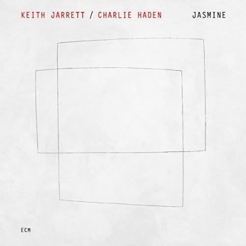
No prizes for al*** graphics here!
Posted by: Hot Rats on 14 May 2010

It hardly makes you want to investigate further!
I'm glad I did though ... This is a great album
Posted on: 15 May 2010 by Lontano
I have to say that I find this cover very attractive, appealing to my minimalistic art tendencies.
At first I thought it was just too simple intersecting rectangles but then realised it is not when I looked a little closer.
I think the texture and feel of this ECM Cover/CD is really nice and if there was a high quality art original of this cover, I would hang it in my home.
Still, as you say, lovely music. I have it playing now as I sit outside eating my breakfast on this lovely sunny morning.
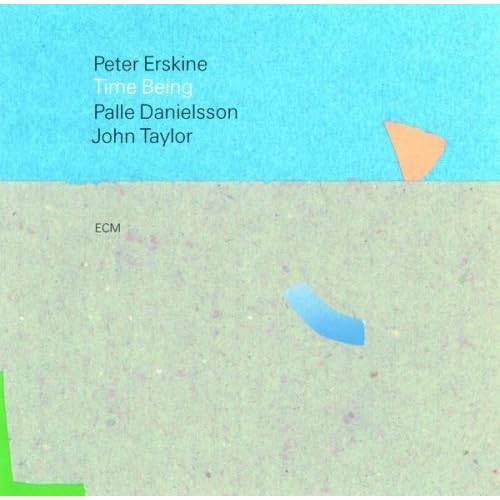
Here are two other covers I really like a lot from ECM, against simplistic and minimalist.


Posted on: 15 May 2010 by MilesSmiles
Love the covers and the music.
Posted on: 16 May 2010 by Voltaire
quote:Originally posted by MilesSmiles:
Love the covers and the music.

Posted on: 16 May 2010 by mudwolf
great economy of design, I too thought it was just 2 rectangles.
one design class I had was a drawing with 5 lines. There were some very interesting solutions but the teacher blew us away with slides of the best past projects. Your mind was the only limitation. Some people didn't understand that and they had very boring work.
one design class I had was a drawing with 5 lines. There were some very interesting solutions but the teacher blew us away with slides of the best past projects. Your mind was the only limitation. Some people didn't understand that and they had very boring work.
Posted on: 16 May 2010 by Diccus62
quote:Originally posted by Doctor Jazz:
It hardly makes you want to investigate further!
I'm glad I did though ... This is a great album
Can't explain but I like the simplicity of it
