New Posters
Posted by: Karl on 20 March 2014
Just seen the new posters,what do you think? Ordered my set already!
Karl
There was a thread at one stage called something like "is Naim a cult"
we now have our answer.
SJB
I've been waiting for some new posters by Naim for ages, but these do nothing for me. They're not artistc or creative. They're also too big. They'd only look good in a retailers.
I want the old "sorry I didn't catch your Naim" stuff.
Sorry Naim.
Yes A1 is too big for me too. I do like the Volume one though.
Fine for the end wall of a dem room , not suited to a normal house IMO.
Great posters, ludicrous price. Bit of a statement though.
I just don't know where to put these posters as I have little room left on my walls
I suppose i could take down my Toyota Corolla poster and put the Naim poster in its place, but I really like my iconic Corolla pic.
Then being Irish I have my pics of the Pope and JFK, so I suppose one of these could go for the Naim volume key.
Then again as Mrs Sloop said the Nilfisk poster would be not one of her favourites but I don't know of a better dish washer poster.
Really who do Naim cause me such problems by bringing out these posters.
Frustrated in Dublin
SJB
Personally I was a little disappointed - I was hoping they would re-issue some of the old classics, even if among some other new ones.
And at $80 USD each, they are the "Statements" of posters. I'd rather buy that much music. The volume one was my fave of the 3.
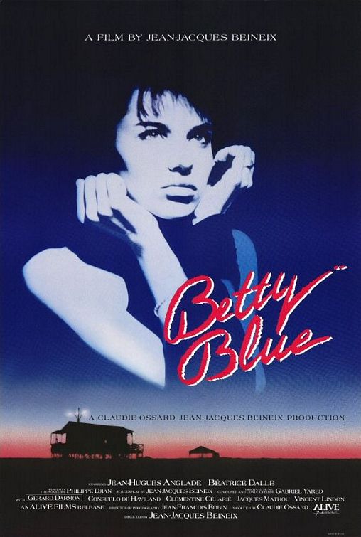
Given the choice between the only two posters (ever) worth having...


...and something which advertises hi-fi (good hi-fi, but just hi-fi), i know where I'd go. Pretty girl's bum or a volume knob? One of life's less difficult choices.
And if I couldn't have Dalle or the Tennis Girl, I would go for a nice old Soviet propaganda poster done by someone like El Lissitzky

Positives about the Naim posters?
At least it's not a kitten hanging by a wire. Or a lighthouse in a stormy sea.
Positives about the Naim posters?
At least it's not a kitten hanging by a wire. Or a lighthouse in a stormy sea.
But it's not a girl scratching her arse either. ![]()
Kevin - what is the second poster? I can sound out the words but I don't know any of them, and it;'s too late & am too lazy/tired to work a Cyrillic keyboard to do a translator...
Doc, it's El Lissitsky's "Beat the Whites with the Red Wedge!" ("Клином красным бей белых!") from 1919, a propaganda poster from the Russian Civil War. The "red wedge" is the Bolsheviks, obviously, and the "whites" the anti-communists.
Positives about the Naim posters?
At least it's not a kitten hanging by a wire. Or a lighthouse in a stormy sea.
But it's not a girl scratching her arse either. ![]()
In my mind the photographer got a little shutter happy on that one, as I suspect the real money shot was yet to come when she retrieved a ball.
In my mind the photographer got a little shutter happy on that one, as I suspect the real money shot was yet to come when she retrieved a ball.
![]()
You say 'good for a dem room' but actually they're not really good for a dem room because they imply bias. If the dealer is purely a Naim dealer, then OK, but if not then it's tantamount to biased selling to have something like that up in the demo room, or indeed anywhere in the shop, except where the products are on display.
As for the posters themselves, they're obviously nicely made and reflect the rather smart Savile row suit of the current products, rather than the maverick tongue in cheek 'didn't catch your naim, nobody without a naim' series which were so endearing (and at the same time put so many people's backs up).
Regards,
Frank.
All opinions are my own and do not reflect the opinion of any organisations I work for, except where this is stated explicitly.
(Kev's taste in birds is well dodgy)
I'm sure Mrs Kev will be flattered to hear that.
What a gent you are.
I think my darling wife must be psychic......all I did was forward the email to her and accidentally mention that I really liked the "Volume" poster and she's only gone and bought it for me!!!!!!!!
Anyone think that will work for a HDX????
Nice one Dave. ![]()
The £30000 or £40000 I spent on Naim over the yearsI thought they could have given me one free
Personally I'm not one to wear logos and have precious little wall space for anything but unique art from people I know (can't afford famous people art). This is more of a commercial art to my mind and there certainly is a place for it.
I appreciate a well done graphic and the 40 year anniversary deserves a note. The past, present and future theme is appropriate. But for me the place for a naim logo is right on the box what makes the music. Brilliant stuff.
Now, if they made some nice boxer briefs with the Naim logo and some pithy statement about "performance" then I'd probably go for that in a big way.
What? That's not weird.
