Favourite Album cover
Posted by: TOBYJUG on 12 August 2018
There have been numerous threads for worst album cover in the past, but what about your favourites ?
Might be that it simply best visually represents the music within. Conjures memories of posters on the wall as a youth. An image that caught your attention before hearing it. Something that defined the way it was listened too. An iconic image that has stood the test of time ?
:format(jpeg):mode_rgb():quality(90)/discogs-images/R-654207-1249525664.jpeg.jpg)
One my favourites.
Just about anything by Globe Propaganda, but especially this:
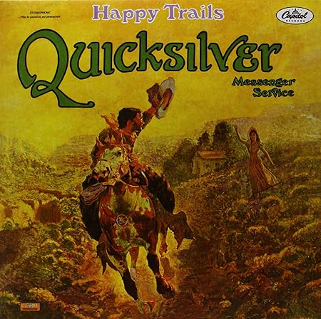
:format[jpeg):mode_rgb():quality(90)/discogs-images/R-3043498-1316889116.jpeg.jpg)
:format[jpeg):mode_rgb[):quality(90)/discogs-images/R-3043498-1316889116.jpeg.jpg)
And anything by Rick Griffin, but especially this:

Have got so many but I do love this one from REM - Fables of the reconstruction - Reconstruction of the fables.
Love the slight mystery in the cover.The burning book.Even the album name which sort of goes full circle.It nicely dovetails the music and slightly abstract Micheal Stipe lyric contained inside.

Also love this one as it nicely reflects the music as Mike Skinner's Rhymes are about working class male life and the cover reflects that.Just a great highrise tower pic.Like the Streets its not trying to be sophistacated - but a great picture non the less
:format(jpeg):mode_rgb():quality(90)/discogs-images/R-45155-1175934571.jpeg.jpg)

If it has to be just one as the OP requested then this would have to be it. I could happily go on digging out a couple of dozen other favourites but...
King Crimson - Court of the Crimson King


One of those albums with nothing written outside, that I just had to hear when I first came across it all those years ago. (And I loved it, and still do!)
It seems Steve_S had the same thought, posting while I was finding pics!
Please don't keep it as just the one.. But please give your honest reasons..

I've always loved this album cover:

A work of art.
For a sense of fun and rewarding a closer examination I've always admired this:

Not an album (it's a 12" single, albeit one of the most lavishly-packaged ever in its original pressing). Factory FAC 73, released March 1983, design by Peter Saville. No mention of the band or title on the sleeve, of course. For those who don't recognise it, it's Blue Monday b/w The Beach, by New Order.

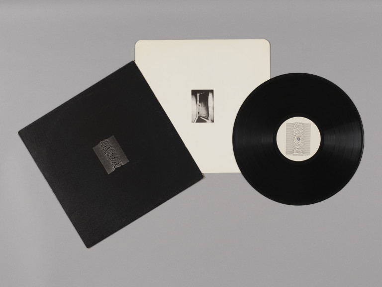
This now iconic cover - Unknown Pleasures by Joy Division (1979) was created by Peter Saville following a suggestion by the band (Bernard found the image in an astronomy book). Again, it makes no mention of the band, except in tiny lettering on the back, and on the spine. Later CD issues have not preserved the original proportions, which is a shame, because it weakens the impact of the design. Back in the days of LPs, this cover had a huge impact on the art of sleeve design.
I also really like the textured sleeve on initial pressings, it really adds to the design's strength.


The original German cover of this classic LP from '74 featured a painting by the band's friend Emil Schult. It's not without charm, but it wasn't until an anonymous hack from Phonogram UK's marketing department redesigned it that the cover, as well as the music within, became an influential classic.
Before:
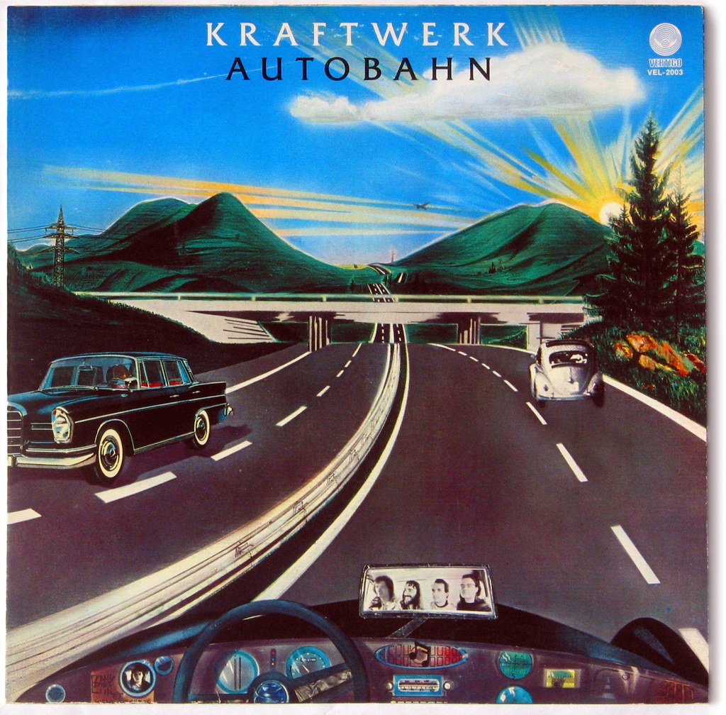
...and after:

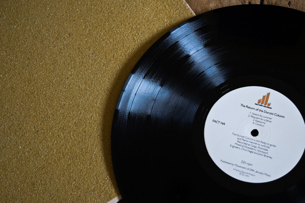
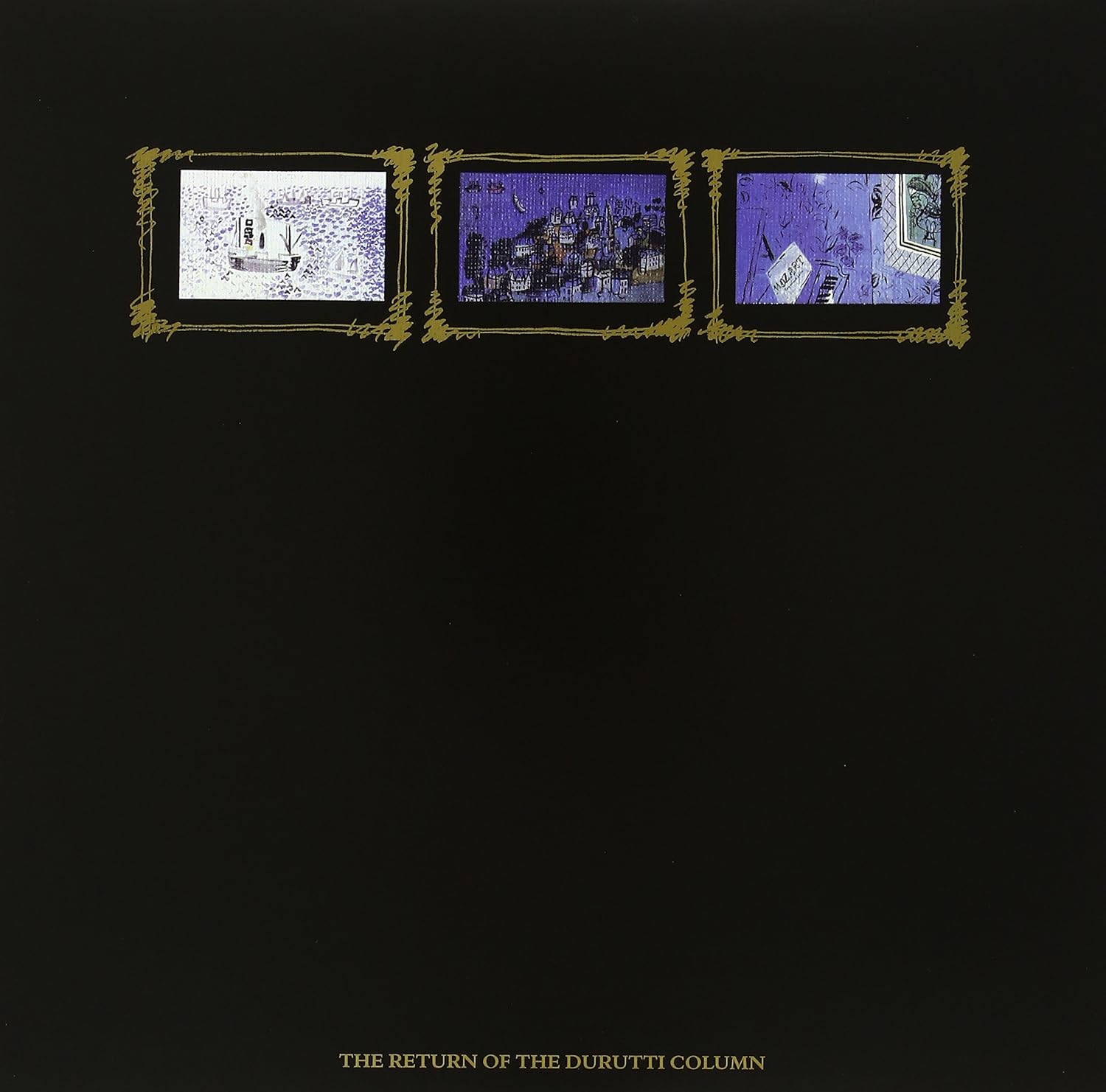
Nigel's posting of the LC cover above eminds me of the first, and best Durutti Column - the infamous The Return of The Durutti Column from 1979, initial pressings of which were housed in a sandpaper sleeve, designed to destroy any record it was filed next to.
The sleeves were famously glued together and assembled by members of Joy Division. The top pic is my own copy.

Some copies were stamped "FACT 14", some were not. Later pressings were housed in a charming sleeve featuring paintings by Raoul Dufy:
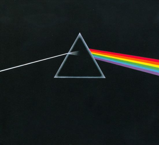
Probably the most successful and influential design team of the late 1960s/1970s/warly 80s was probably Hipgnosis (Storm, Po and Sleazy, usually abetted by graphics genius George Hardie) who worked for all the big acts of the era, most notably the Floyd. Virtually all their covers are winners but these two are probably my favourites.
The first is the acme of clean, simple design and is possibly the most famous LP cover of all time (with only Sgt Pepper rivalling it).
The second is very different, it's all about drama and gritty (sur)realism:

I like how the designers made full use of the rear space too:
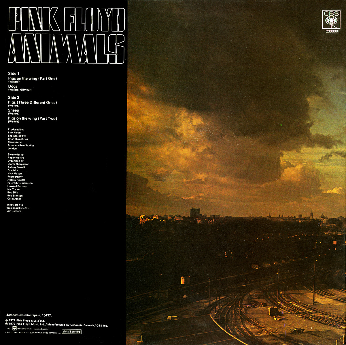
The full picture is really rather striking:

Note how neither cover needs lettering, logos etc on the front. The images are so powerful...

A personal fave. Love the font, love the pic.
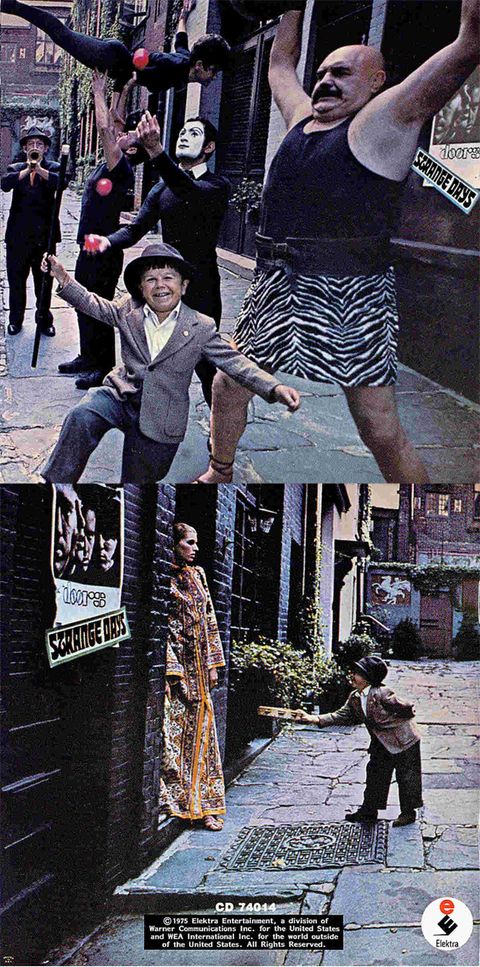
How do you follow up an amazing debut album from some young upstarts ?
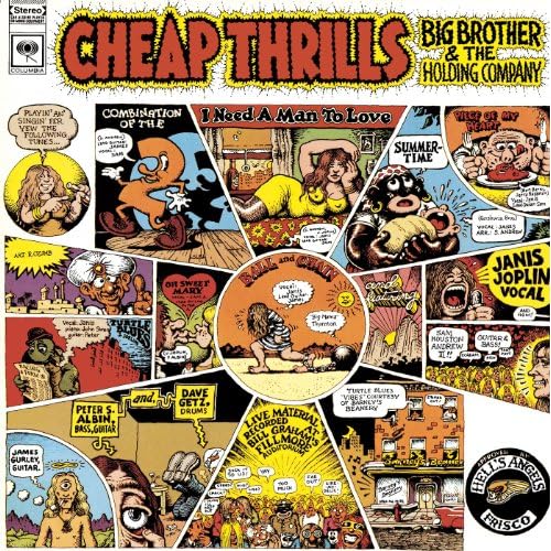
Cheap Thrills - Big Brother & The Holding Company
It was in the '60's, I was in High School, a lot was happening and Janis Joplin belting out the tunes was simply fantastic. The album cover caught my eye in the store and it was one of the better buys of my life!
Glorious use of stark, tightly-cropped B&W photography, and simple type. Red, white and black/grey always works beautifully.

The original above is far superior to the colour revamp which appears on a number of reissues:

Very much of its time (1959), and possibly it wouldn't get past the suits these days, but the photo is great and the type and layout are sensational. All round, a great job by the Warners design department.A good album too.
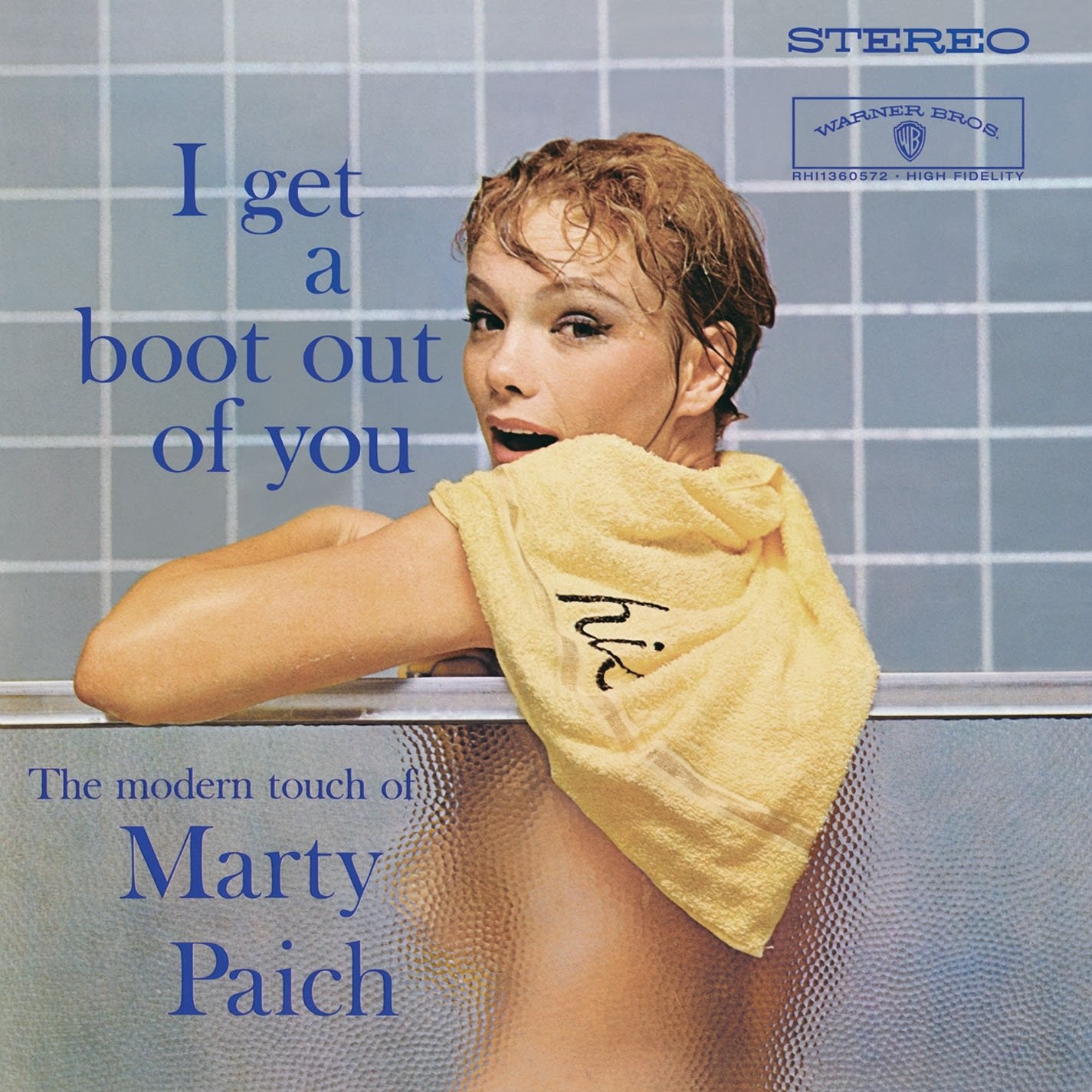
Toby - I think this thread is going to run and run.It's going to be fascinating peoples thoughts on why they love the cover etc.I am sure most people here have got at least 10 fav's - if not more....... ![]()
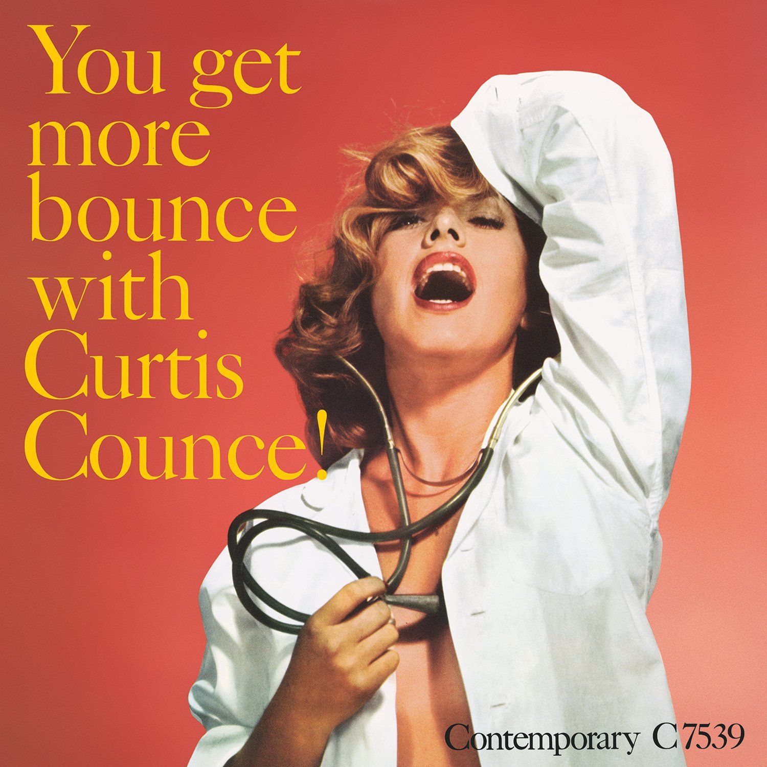
Another Fifties (1957) design that might not pass political muster in 2018, but look at this on the 12 in square canvas of an LP and there's no denying its impact.
It's a beautiful photo, the colour palette is spot on and the oversized type is judiciously used. Simplicity, as ever, is the key, which is why this cover still works when shrunk down to CD size.
Really like this Hipgnosis album cover for A trick of the Tail.It's so understatedly stylish.And what I like it's got all the characters from the album tracks.
:format(jpeg):mode_rgb():quality(90)/discogs-images/R-900699-1320226439.jpeg.jpg)

The Blue Note label is rightly revered for its cutting edge design. Like early Factory under the direction of Peter Saville, BN produced sleeve designs which were all very different but which were clearly part of a 'house style'.
Of the hundreds of brilliant covers the label's teams designed, this from 1964 is my personal favourite. I think it is just beautiful.
Really adventurous - I love how designer Reid Miles has given photography a subordinate role and has concentrated on the dynamic use of type. When I first saw this about 30 years ago I had to buy it, so powerful was the design (the music's not bad either). It's so good that I envy anyone who's seeing this for the first time.


