Favourite Album cover
Posted by: TOBYJUG on 12 August 2018
There have been numerous threads for worst album cover in the past, but what about your favourites ?
Might be that it simply best visually represents the music within. Conjures memories of posters on the wall as a youth. An image that caught your attention before hearing it. Something that defined the way it was listened too. An iconic image that has stood the test of time ?


Warrior On The Edge of Time by Hawkwind is one of my favourites. I even had a lid custom painted with it.
Mulberry posted:Here is another favorite:
Guns, Love and a Cactus in your Heart from Cliff Barnes the Fear of Winning. The cover itself is mat black with the three symbols once in orange and repeatedly in shiny black.

Mulberry,
Great cover - Have looked at it quite a few times and it looks like the three symbols are all falling down on the cover and like the way they are illuminated - Very Stylish and understated.


I'm rather surprised no one has yet chosen this album cover from Led Zeppelin's untitled fourth album. The image is the remaining wall of a house which we can assume is in the process of being knocked down to make way for a high-rise development such as that seen beyond the edge of the wall. Very clever photograph.
Then I also rather like this album cover - Led Zeppelin, Presence.
Just what is the object? What is it meant to represent? Is it harmless? Does it have mystical powers? Or just a presence?
Yeah Yeah Yeahs "It's Blitz!"

Conceptual artist, Urs Fisher, took the lead in art direction for the Yeah Yeah Yeahs' third album, It's Blitz!. The cover featured nothing more than a high-speed photograph of a fist crushing a raw egg into oblivion, yet it was something entirely new.
It was actually the hand of the band's frontwoman Karen O in the photograph, and it's not hard to grasp a sense of her personality from just that: the intensity of the pose juxtaposed with the glam of the painted nails and the oddity of the egg.
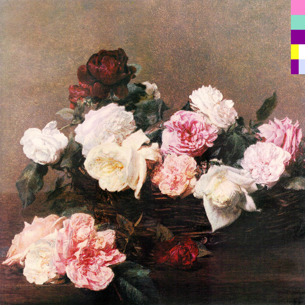
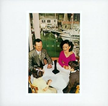
Factory Records' design genius Peter Saville had a wonderful knack, back in 1970s and 80s, of making covers that were artistic statements, separate from the contents of the album they were clothing.
Thus, the design for New Order’s second LP, Power, Corruption & Lies (May 1983) had a colour-based code to represent the band's name and the title of the album, but they were not actually written on the original UK sleeve itself (they were present on some non-UK versions), although the catalogue number "FACT 75" does appear on the top-right corner. The decoder for the code was featured prominently on the back cover of the album and can also be seen on the "Blue Monday" and "Confusion" singles. That gave letter writers to the NME plenty to chew over back in the day, I can tell you!
Biut the real scoop is the image, a reproduction of the painting "A Basket of Roses" by French artist Henri Fantin-Latour, which is part of the National Gallery's permanent collection in London.
One day while visiting the gallery Saville picked up a postcard with Fantin-Latour's painting, and his girlfriend (Martha Johnson of Matha & The Muffins) mockingly asked him if he was going to use it for the cover.
Saville then realised it was a great idea: “the flowers suggested the means by which power, corruption and lies infiltrate our lives. They're seductive."
The cover was also intended to "create a collision between the overly romantic and classic image which made a stark contrast to the typography based on the modular, colour-coded alphabet”.
Saville and Tony Wilson, Factory’s majordomo, also said that the owner of the painting (The National Heritage Trust) first refused Factory access to it. Wilson then called up the gallery director to ask who actually owned the painting and was given the answer that the Trust belonged to the people of Britain, at some point. Wilson then replied, "I believe the people want it." The director then replied, "If you put it like that, Mr Wilson, I'm sure we can make an exception in this case."
It’s a cover I love, and which still looks great, especially on vinyl.
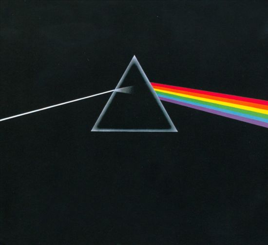
Kevin-W posted:Probably the most successful and influential design team of the late 1960s/1970s/warly 80s was probably Hipgnosis (Storm, Po and Sleazy, usually abetted by graphics genius George Hardie) who worked for all the big acts of the era, most notably the Floyd. Virtually all their covers are winners but these two are probably my favourites.
The first is the acme of clean, simple design and is possibly the most famous LP cover of all time (with only Sgt Pepper rivalling it).
The second is very different, it's all about drama and gritty (sur)realism:
I like how the designers made full use of the rear space too:
The full picture is really rather striking:
Note how neither cover needs lettering, logos etc on the front. The images are so powerful...

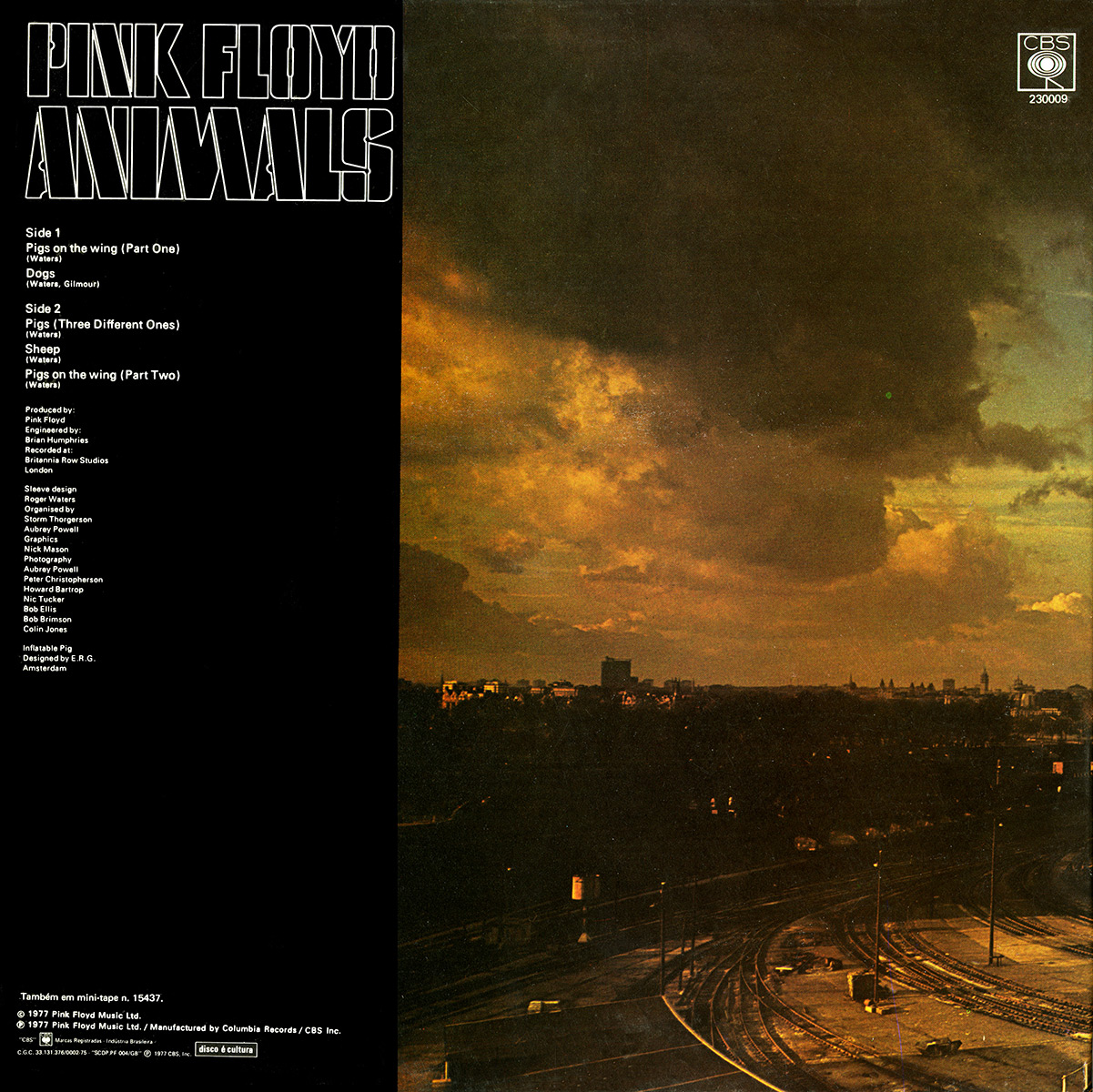

Animals...
the year that I was born.
The thing is: I grow up listening to PF.
I have memory’s of seeing the sheep running round ‘n’ around in the LP from an early age as of 3/4...
Only a decade later realize that it was NOT the most beautiful painting i have seen but a photo, of an existing Power Plant. ????
good music and nice concept.
We already discussed about this cover in another thread, but I have to say - I like to look at it...

Kevin-W posted:
Factory Records' design genius Peter Saville had a wonderful knack, back in 1970s and 80s, of making covers that were artistic statements, separate from the contents of the album they were clothing.
Thus, the design for New Order’s second LP, Power, Corruption & Lies (May 1983) had a colour-based code to represent the band's name and the title of the album, but they were not actually written on the original UK sleeve itself (they were present on some non-UK versions), although the catalogue number "FACT 75" does appear on the top-right corner. The decoder for the code was featured prominently on the back cover of the album and can also be seen on the "Blue Monday" and "Confusion" singles. That gave letter writers to the NME plenty to chew over back in the day, I can tell you!
Biut the real scoop is the image, a reproduction of the painting "A Basket of Roses" by French artist Henri Fantin-Latour, which is part of the National Gallery's permanent collection in London.
One day while visiting the gallery Saville picked up a postcard with Fantin-Latour's painting, and his girlfriend (Martha Johnson of Matha & The Muffins) mockingly asked him if he was going to use it for the cover.
Saville then realised it was a great idea: “the flowers suggested the means by which power, corruption and lies infiltrate our lives. They're seductive."
The cover was also intended to "create a collision between the overly romantic and classic image which made a stark contrast to the typography based on the modular, colour-coded alphabet”.
Saville and Tony Wilson, Factory’s majordomo, also said that the owner of the painting (The National Heritage Trust) first refused Factory access to it. Wilson then called up the gallery director to ask who actually owned the painting and was given the answer that the Trust belonged to the people of Britain, at some point. Wilson then replied, "I believe the people want it." The director then replied, "If you put it like that, Mr Wilson, I'm sure we can make an exception in this case."
It’s a cover I love, and which still looks great, especially on vinyl.
Bugger, that record was in my Oxfam the last time I was in. I will look again tomorrow.
Bert Schurink posted:We already discussed about this cover in another thread, but I have to say - I like to look at it...
Which makes you sound rather pervy.

Simple but so evocative.
Christopher_M posted:Kevin-W posted:
Factory Records' design genius Peter Saville had a wonderful knack, back in 1970s and 80s, of making covers that were artistic statements, separate from the contents of the album they were clothing.
Thus, the design for New Order’s second LP, Power, Corruption & Lies (May 1983) had a colour-based code to represent the band's name and the title of the album, but they were not actually written on the original UK sleeve itself (they were present on some non-UK versions), although the catalogue number "FACT 75" does appear on the top-right corner. The decoder for the code was featured prominently on the back cover of the album and can also be seen on the "Blue Monday" and "Confusion" singles. That gave letter writers to the NME plenty to chew over back in the day, I can tell you!
Biut the real scoop is the image, a reproduction of the painting "A Basket of Roses" by French artist Henri Fantin-Latour, which is part of the National Gallery's permanent collection in London.
One day while visiting the gallery Saville picked up a postcard with Fantin-Latour's painting, and his girlfriend (Martha Johnson of Matha & The Muffins) mockingly asked him if he was going to use it for the cover.
Saville then realised it was a great idea: “the flowers suggested the means by which power, corruption and lies infiltrate our lives. They're seductive."
The cover was also intended to "create a collision between the overly romantic and classic image which made a stark contrast to the typography based on the modular, colour-coded alphabet”.
Saville and Tony Wilson, Factory’s majordomo, also said that the owner of the painting (The National Heritage Trust) first refused Factory access to it. Wilson then called up the gallery director to ask who actually owned the painting and was given the answer that the Trust belonged to the people of Britain, at some point. Wilson then replied, "I believe the people want it." The director then replied, "If you put it like that, Mr Wilson, I'm sure we can make an exception in this case."
It’s a cover I love, and which still looks great, especially on vinyl.
Bugger, that record was in my Oxfam the last time I was in. I will look again tomorrow.
Gone.

The same is true of their previous album.
For some reason this cover didn’t really catch on.
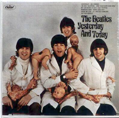
In the late 70s, I borrowed my college roommate's copy of "Yesterday & Today"; it had previously been his sister's (had her name written on the back in classic pre-teen scrawl). I wondered, and took the liberty of starting to peel back the cover image, and lo and behold, he had one of the Butcher Baby covers. I, of course, let him know, and he was so excited about his windfall he gifted me a White Album on white vinyl (regrettably now long gone during some personal financial crisis). Was cool to have discovered it for him!
I always liked this one for some reason - I found humor in it. They are sitting just to the left of the dugout.

hungryhalibut posted:Bert Schurink posted:We already discussed about this cover in another thread, but I have to say - I like to look at it...
Which makes you sound rather pervy.
Nah... it’s the light. I see the light. ????
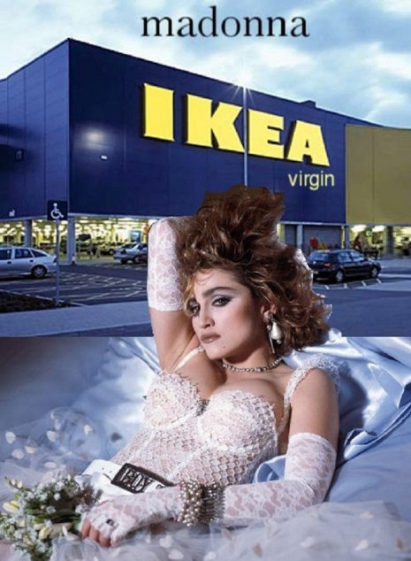
Someone put together album covers with one letter missing..
https://www.thepoke.co.uk/2018...bsolutely-ingenious/
TOBYJUG posted:
Someone put together album covers with one letter missing..
https://www.thepoke.co.uk/2018...bsolutely-ingenious/
Clever. I liked the Led Zep I cover.
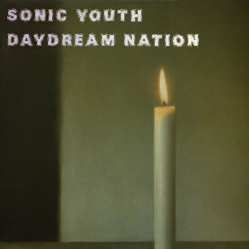
Keeping it arty. This was taken from Gerhard Richter's series of paintings from a photo realist study of still life candles, only using 1950s cameras.