Favourite Album cover
Posted by: TOBYJUG on 12 August 2018
There have been numerous threads for worst album cover in the past, but what about your favourites ?
Might be that it simply best visually represents the music within. Conjures memories of posters on the wall as a youth. An image that caught your attention before hearing it. Something that defined the way it was listened too. An iconic image that has stood the test of time ?

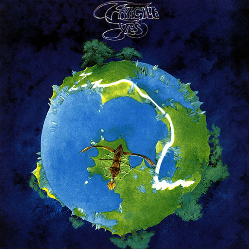
From the big H Boss. Probably the first and greatest conceptual prog rock album cover artist ever..

Maybe a toss up between this and DSOTM for most iconic, but it seems impossible to walk into a record shop today and not see the Abbey Road cover prominently displayed, typically in large format.
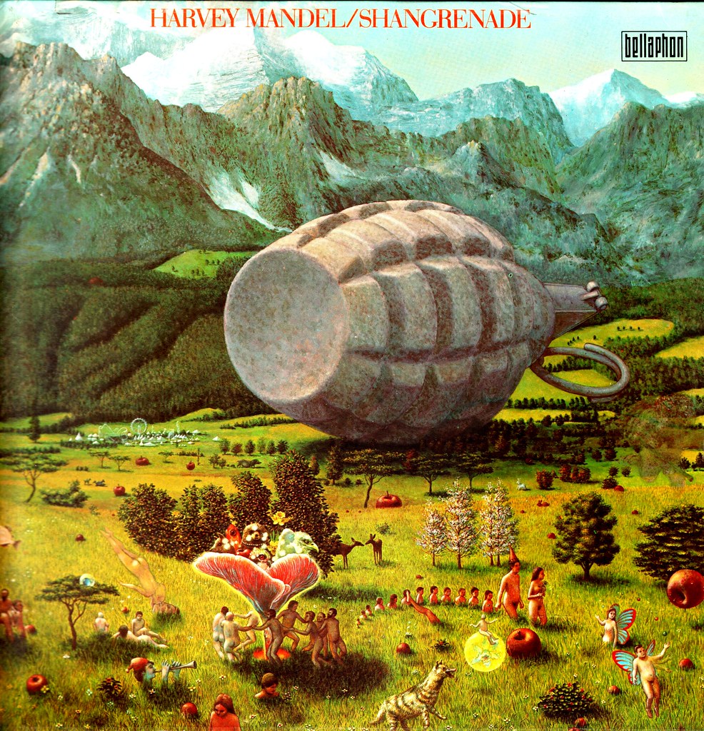
Mati Klarwein must feature high in the list of all-time great album sleeves. My favourite:
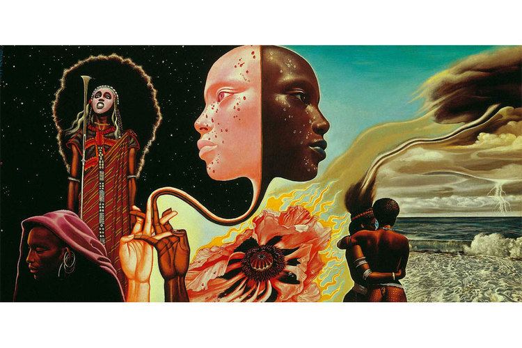
But he did dozens of others, including:
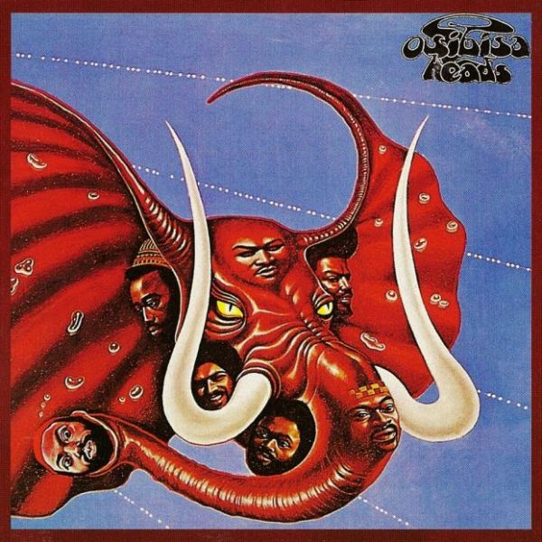
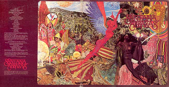

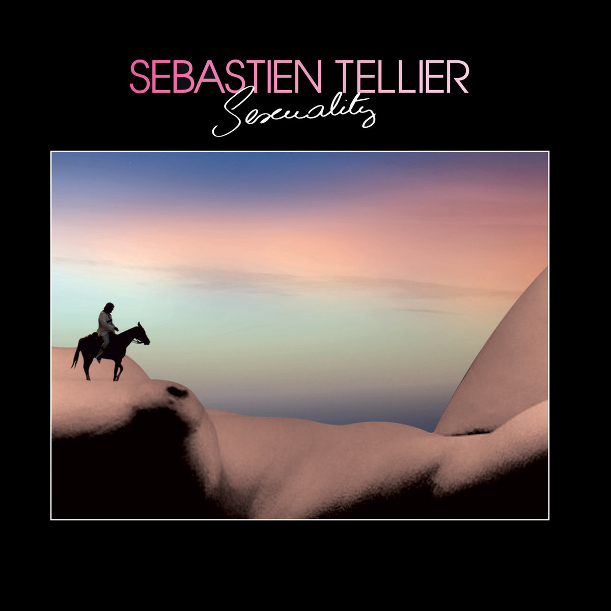
Keeping it Pervy I like this cover.
Although this is my all time favourite moving image accompaniment for a piece of music..
joerand posted:
Maybe a toss up between this and DSOTM for most iconic, but it seems impossible to walk into a record shop today and not see the Abbey Road cover prominently displayed, typically in large format.
Not surprised that you picked this one, joerand. ![]()

Sailing a motorcycle has two or three drawbacks. Still, overall, worked out pretty well it seems.

In 1980, Orchestral Manouvres In The Dark's first, self-titled album was issued on Virgin subsidiary DinDisc. The sleeve was designed by Factory wunderkind Peter Saville along with Ben Kelly (who went on to design The Haçienda).
It was a pleasingly minimalist design, a black and orange inner slotting neatly into a die-cut blue sleeve. IIRC, other colour variations were available!
Surprised nobody's mentioned this Hipgnosis classic from October 1970. Nothing on the front or back, just pictures of cows. The group name, album title and catalogue number appeared on the spine, fortunately.
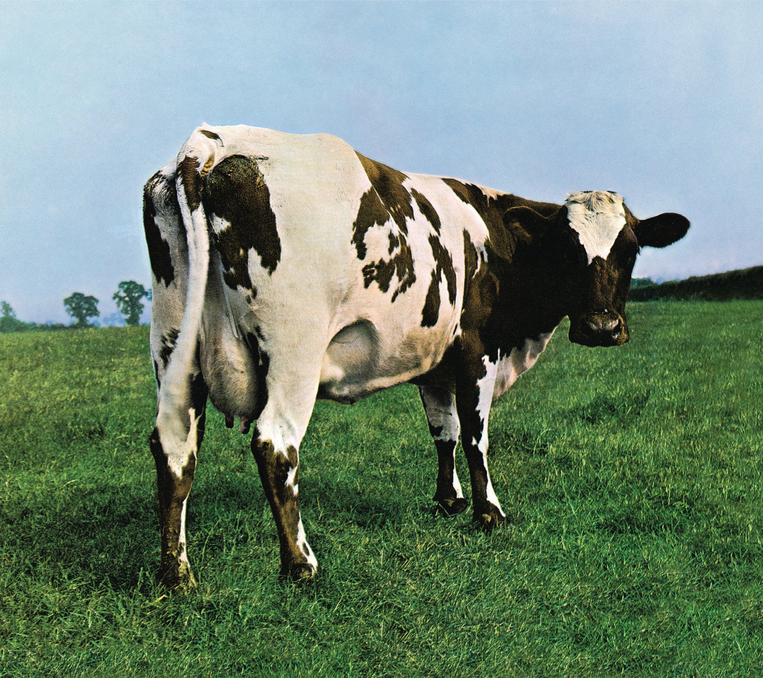
I really like minimalist sleeves and I am especially fond of sleeves that communicate absolutely nothing whatsoever. Not even the record title and the band name. Pink Floyd and Led Zep ruled this particular 'enigmatic' roost in the 1970s, and Peter Saville and his acolytes took up the cudgels in the 1980s.
Saville's most wilfully obscurantist piece of design during the decade was perhaps for New Order's fourth LP, Brotherhood (1986). The cover was a photo of a sheet of zinc-titanium alloy that had been stamped. The only information on the cover was the catalogue number (FACT 150) on the spine. The tracklist and credits for the album were in tiny type at the bottom of the plain white inner.
There was an early limited edition version of the LP (and CD) that was issued in a metallic sleeve. I have this as well as the standard version, and it looks and feels lovely, although it's quite difficult to scan or photograph...



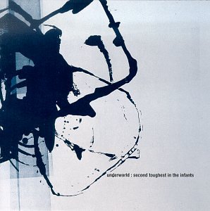


Here’s one to go with the cornflakes.
 Black and white is a blessing in this case I think.
