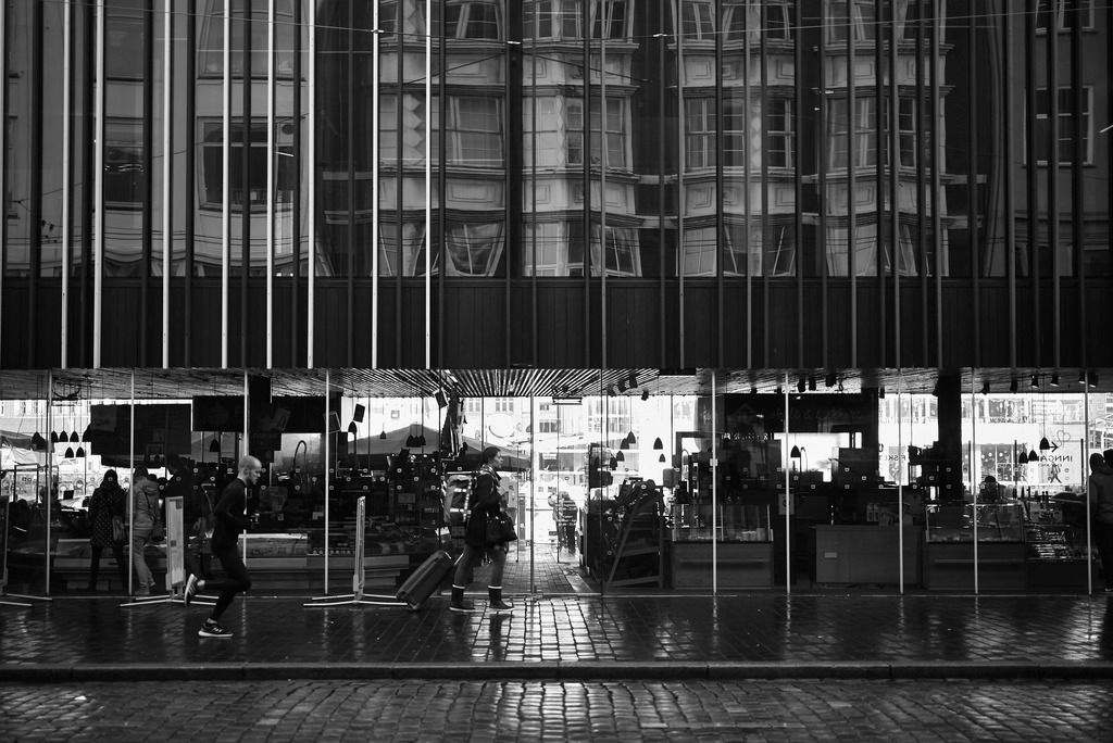
Nice Photos.
Posted by: u5227470736789439 on 27 February 2008
Here is my candidate as being almost quite good. In fact it is two painstakingly joined.

Taken up in the mountain at Skurdalsvatn in 2000.
Though this one takien in Warsaw in November 2006 is not bad:

I know there are several good photgraphers here, and it would be nice to see some of you best efforts if you feel inclined to share!
George
Mr Fjeld posted:JamieWednesday posted:I really like this picture although it makes me uncomfortable...
Having served myself - although not in active conflict it kind of makes me feel guilty. The girl looking away almost saddened and the one looking straight at you has a strong effect. And then you have the blood, the blue clothes worn by innocent little girls..
A very good picture working perfectly as intended. A strong message which would have me emptied my pockets if I was there.
Im obviously missing something here: the background makes it clear that it's neither a war zone nor a scene of terrorism or tragic accident, and the 'blood' is clearly imitation, so it is a pictipure of some sort od fancy dress, maybe halloween, the only reference to war being what might be an empty possibly former ammo box (as commonly used as a waterproof container for equipment on watery expeditions). If the photo was supposed to convetpy something more sinister it needed attention to the backround, and something more to hint at tragedy rather than a posed image.
Innocent Bystander posted:Mr Fjeld posted:JamieWednesday posted:I really like this picture although it makes me uncomfortable...
Having served myself - although not in active conflict it kind of makes me feel guilty. The girl looking away almost saddened and the one looking straight at you has a strong effect. And then you have the blood, the blue clothes worn by innocent little girls..
A very good picture working perfectly as intended. A strong message which would have me emptied my pockets if I was there.
Im obviously missing something here: the background makes it clear that it's neither a war zone nor a scene of terrorism or tragic accident, and the 'blood' is clearly imitation, so it is a pictipure of some sort od fancy dress, maybe halloween, the only reference to war being what might be an empty possibly former ammo box (as commonly used as a waterproof container for equipment on watery expeditions). If the photo was supposed to convetpy something more sinister it needed attention to the backround, and something more to hint at tragedy rather than a posed image.
Well, no need to worry then as you're obviously just an Innocent Bystander. The association of children, blood, ammo boxes and the use of the how the girls use their focus is actually having an effect on me. Honestly, did you really believe I thought this was some sort of authentic photo?
You do not have to feel anything at all - and to be honest, I couldn't care less about how you feel or not! This is how this picture speaks to me and I'm not about to be corrected for doing that. This is a good picture and it may resonate perfectly different with you.
Mr Fjeld posted:Fish Market in Bergen - Norway
I Like the double perspective which took a few seconds to dawn on me.
Hmmm...OK
The twins pic was at a Zombie Walk. Not posed at all. They were wandering around collecting for Breast Cancer charity, using the ammo tin for the collection (perhaps a more enlightened use than that for which it was intended). The left twin looked straight at me, while the other was still looking at the woman with half her face missing trying to find her purse. I liked the moment, one staring, the other apparently reflecting, I took the pic.
I liked it for what it was. I can also see exactly where Mr F is coming from, it does carry overtones of exactly what he states and I can see his perspective completely. On the other hand it is what it is.
And when it comes to it, without wishing to puff up my own output any, isn't that what photography, all art, does? It gives us all a chance to see what we wish to see and relate it to our own experiences. Our likes, dislikes, past, presents and futures. Indeed, Jack Torrance would probably have his own, unique perspective (see 'The Shining' if you're uncertain about the context).
Anyhow, nothing to fall out about.
Two rivers meet...

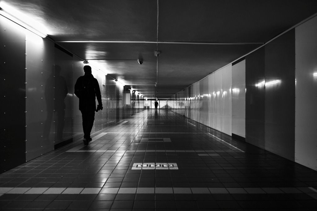
Haim, it is always a pleasure to look at your photos. So thanks for sharing them here. Regarding the one above, I think one of the granite tiles is mounted in a slightly different angle. The one giving the reflection of the man in shorts seems to be the one. It looks like its bottom left is closer to the back wall or to put it in another way, a little farther from the point of view. That would make the man in shorts the odd reflection and explain the step in the reflection of the white ad as well.
Mulberry posted:Haim, it is always a pleasure to look at your photos. So thanks for sharing them here. Regarding the one above, I think one of the granite tiles is mounted in a slightly different angle. The one giving the reflection of the man in shorts seems to be the one. It looks like its bottom left is closer to the back wall or to put it in another way, a little farther from the point of view. That would make the man in shorts the odd reflection and explain the step in the reflection of the white ad as well.
Thanks for responding. The idea that one of the granite panels is mounted at a slightly different angle reflecting another person makes sense. However, since that man is further away fro the wall, actually completely out of the scene, shouldn't his reflection on the granite be much smaller than the guy in shorts?
Haim
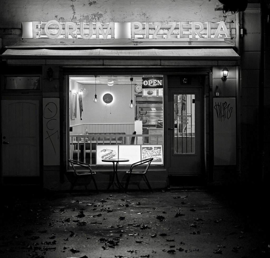
Open!
Pinched from The Guardian..........................Alex Bartsch cycled around London, rephotographing locations previously featured on UK reggae album covers..................nice original idea.
https://www.theguardian.com/ar...e-covers-photographs
Copy and paste the link into your browser for a look.
Eloise posted:I do hope that's not your tongue...
No. I don't do selfies.
Haim Ronen posted:Eloise posted:I do hope that's not your tongue...
No. I don't do selfies.
Then I hope it's not your wife's tongue (or GF's, husband's, parents or even dog's tongue) either. :-)
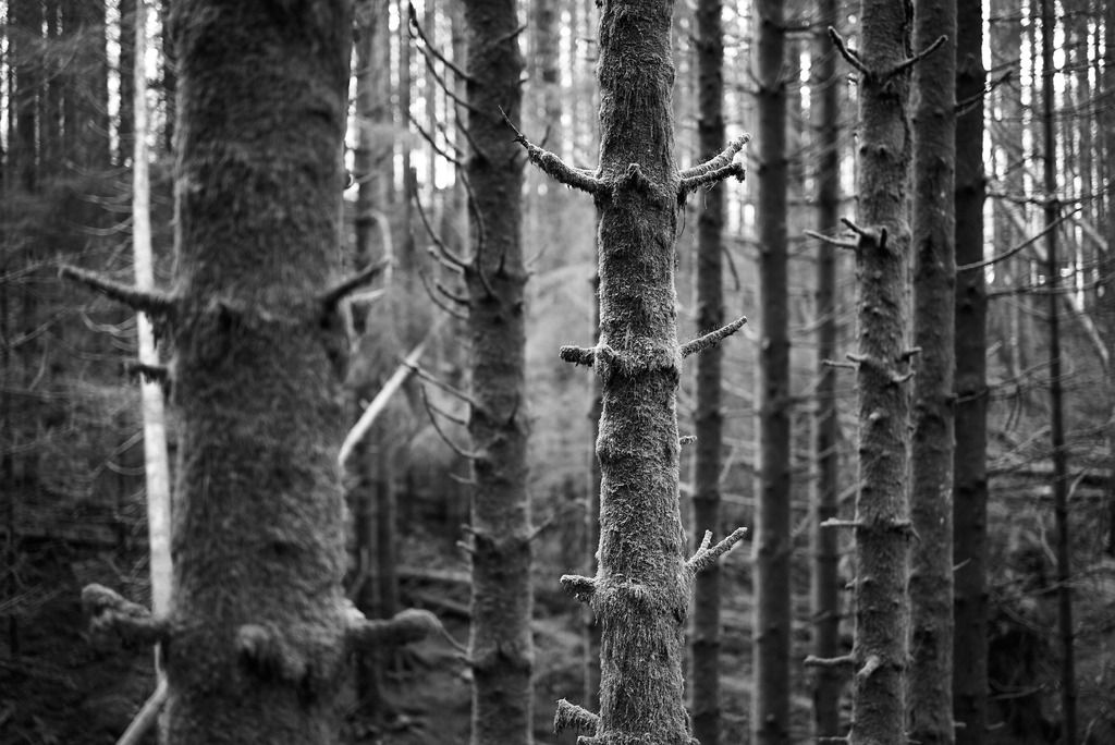
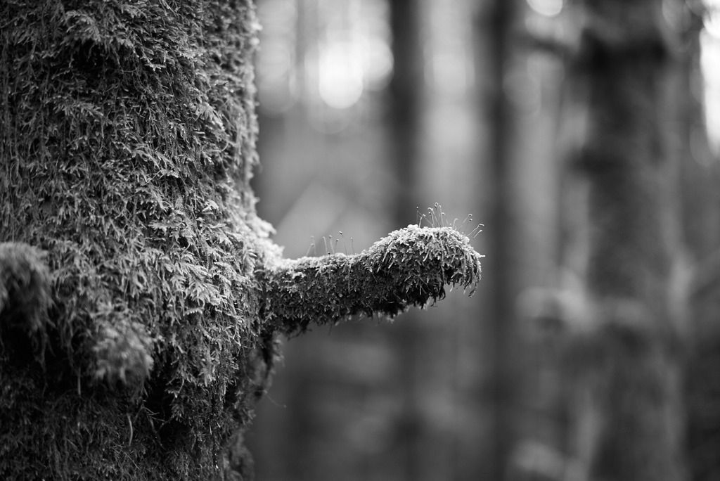
Nature imitating man..... sorry, couldn't resist ![]()
MR FJELD,
Do you mean a Viagra forest? The first thing that came to my mind looking at your top image was deer antlers.
Haim Ronen posted:MR FJELD,
Do you mean a Viagra forest? The first thing that came to my mind looking at your top image was deer antlers.
Oh, I much prefer deer antlers ![]()


