Favourite Album cover
Posted by: TOBYJUG on 12 August 2018
There have been numerous threads for worst album cover in the past, but what about your favourites ?
Might be that it simply best visually represents the music within. Conjures memories of posters on the wall as a youth. An image that caught your attention before hearing it. Something that defined the way it was listened too. An iconic image that has stood the test of time ?
The Cure have always had a strong visual image. This one, for the live album Concert, went hand in hand with how they sounded at the time...

And, even though it’s a single, I adore everything about this image. It makes me want to pick up my guitar and pretend to be a rock god. If only...

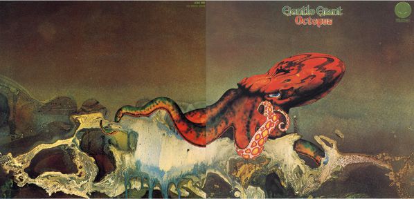
Innocent Bystander posted:...On the subject of visual art, not a strong subject of mine, artist that has featured on a number of records I like, with a characteristic style is Roger Dean (and the paintings are quite something in the flesh). Yes albums of course, but I’ll post something less common from my collection:
Gentle Giant - Octopus. Not actually my favourite of their albums: that honour goes to Three Friends.
I forgot about this wonderful LP cover. Fabulous. Just what a gatefold sleeve was meant for...
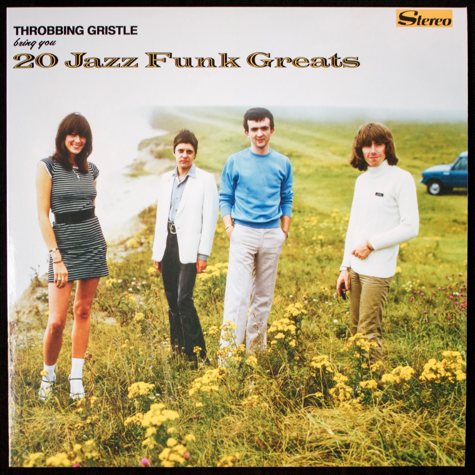
When it first came out in 1979, the cover of this classic caused a bit of a stir in the music press. The kitsch, middle-classes-at-play image (note the Range Rover in the background and the casual knitwear worn by Chris and Sleazy) was far removed from what one might expect from this most confrontational of bands.
The picture was shot at Beachy Head on the Sussex coast, then one of England's suicide hotspots.
Kev,
I am so with you on the Animals cover and your words about it.I always remember back in 1977 when I was 13 seeing it for the first time and thinking this is fabulous.I loved the clouds on the back cover and all the black and white pics of a derelict Battersea power station.Little things on the packaging like the label on the vinyl.I really think Animals is so up there as it still gives me a buzz seeing it now.Compact Discs in comparison packaging wise are a bit soul less.......Give us a gatefold ![]() -
-
This is a great thread Toby posted.....a classic !
Always loved this one from the Byrds - 1966 The Beatles where on Revolver and the Byrds had just released this master piece
:format(jpeg):mode_rgb():quality(90)/discogs-images/R-399668-1211404776.jpeg.jpg)
And this is Brilliant - David Crosby had just left so for the album cover shoot they replaced him with a horse....just makes me smile every time I see it...just so dry !

Have always liked Savoy Brown’s gatefold album covers (e.g., Hellbound Train).
Jade Warrior also produced some good album art.
![]()

They certainly knew how to make covers in the pre-rock era. This 1958 Nelson Riddle on Capitol is another beauty:

This is a pretty decent West Coast jazz album (originally from 1959), with some good players, but it's blown out of the water by a Very Silly Cover. And that is why I love said Very Silly Cover (it's actually a terrible piece of design - too cluttered, with too many different typefaces in inappropriate colours for their backgrounds and no proper grid. it looks - quite literally - as if it's been thrown together randomly).

Here is another favorite:

Guns, Love and a Cactus in your Heart from Cliff Barnes the Fear of Winning. The cover itself is mat black with the three symbols once in orange and repeatedly in shiny black.
The “Tjader plays Mambo” cover posted by Kevin made think of this one:

The one I own is even nicer as it is without the white “Stereo” bar at the top. Every time I play this LP I think about what is not shown.
What really make this cover for me is place unusual placement of the type:

Here's the principle of the Stitt album above taken much further and in a way it works even better:

Kev, Now you're being silly. Can we have some sort of perspective here, please?![]()
Some more have come to mind:
1) firstly a somewhat disturbing image, somewhat reminiscent of The Scream introduces an album that is a curious mix, impossible to categorise to a genre:

This is Nitin Sawnhey’s Beyond Skin for anyone unable to see the image. I particularly like the opening track, Broken Skin, and the musical contrast of other tracks including the strong Indian influences, another stand out track being Nadia, subsequently covered so beautifully by Jeff Beck
2) Harking back to the early days of gatefold LP sleeves that people spent hours reading lovingly, in the whole package that complemented the record within, this one was particularly lavish with a multipage booklet within.

Moody Blues’ On the Threshold of a Dream, maybe overall my favourite of their albums (or maybe not, depending on which I played last...)
3) Now a quite stunning album cover image, a bit surprising it hasn’t yet been posted

Nirvana’s Nevermind, with the classic track Smells Like Teen Spirit, that simply has to be played loud...
I like Roger Dean's Yes album covers,
this is the cats choice : )

Tony2011 posted:
Kev, Now you're being silly. Can we have some sort of perspective here, please?
Don't fancy yours much T. You'll be posting May Blitz next!
The Fool were Dutch artists Marijke Koger and Simon Posthuma, who did a lot of work for The Beatles (Apple, the inner sleeve of Sgt. Pepper, their clothes for All You Need Is Love, Lennon's Rolls Royce et al.). They also designed covers for the first Move Album, The Hollies' Evolution as well as their own endearingly dippy LP, but my favourite is the second Incredible String Band:

P.S. This was their proposed inside cover to Sgt. Pepper. Hard to imagine now.
Great thread idea Kevin.
So hard to choose a single one. Most things by Hipgnosis / Peter Saville / Peter Blake. A few for me that spring to mind..
Pink Floyd. Wish You Were Here. The simplicity of the photo of the man on fire (so quietly disturbing) on stark white, with the photo break out top RHS. A lesson in design understatement. The inner sleeve, the design of the label handshake illustration too. So not just the cover, but the whole package. Plus, when a stude, I had the pleasure of being taught by the great George Hardie himself, who, during a tutorial showed his original designs for this, and other PF (and other) albums - such a privileged insight.


The Beatles Revolver. Just ‘cause its my fav Beatles album cover and I love the exaggerated stylised line drawings by Klaus Voormann - superb.

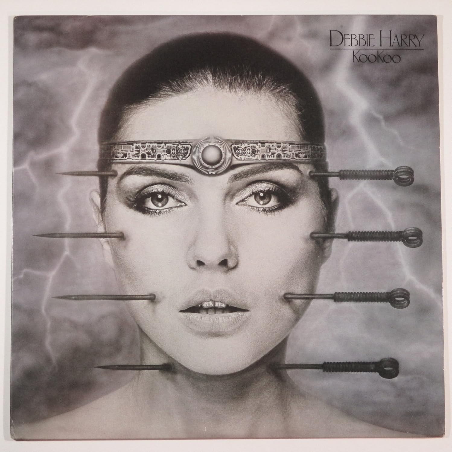
Debbie Harry. Koo Koo. Well, its Mr Gieger creating such a striking and arresting image based around a simple visual concept that still shocks. Has there been a better freehand airbrush artist?
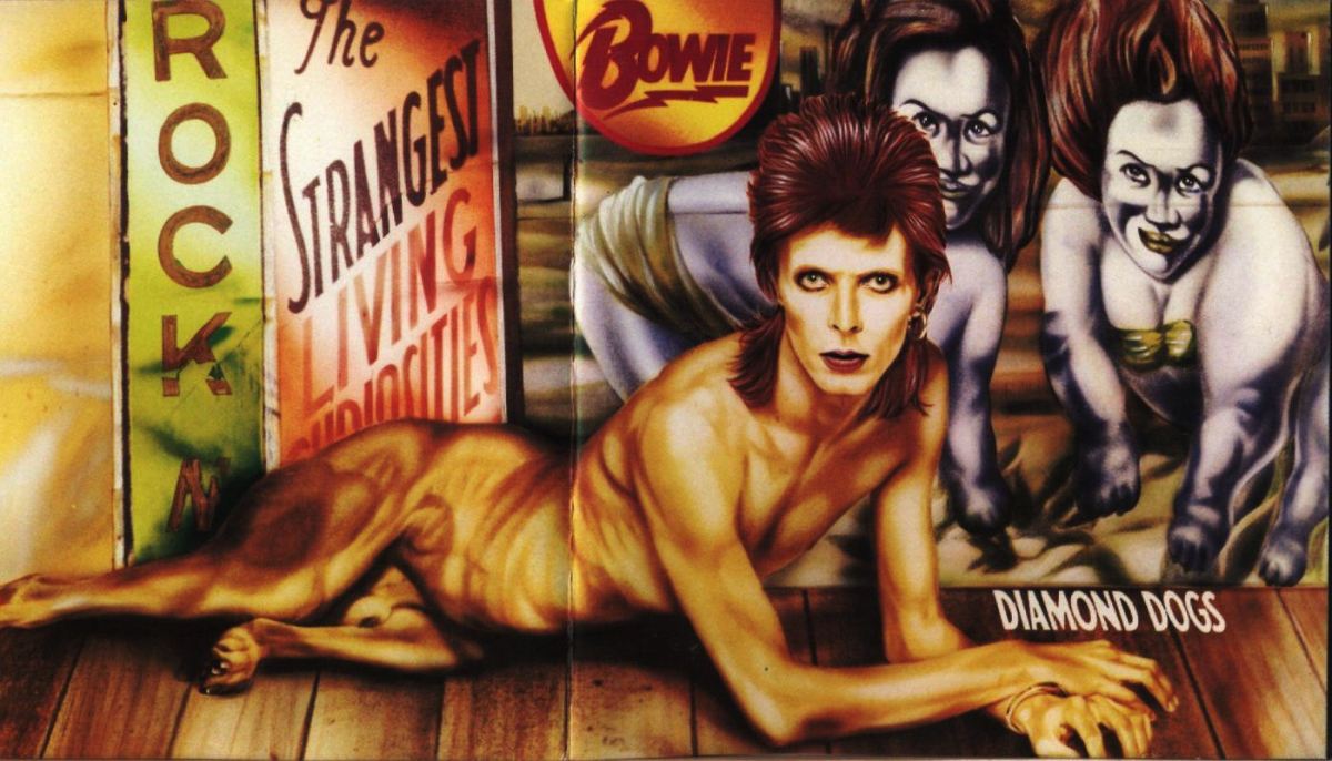
David Bowie: Diamond Dogs. Prob not Bowie’s ‘best’ album cover, but certainly one of the most arresting. I still find the Guy Peellaert surrealist illustration a little eery. Arguably its 70’s Sci-Fi kitsch and looks dated now, but I still think it has raw power, esp in its full gatefold glory. So much so that I have five copies of this album on vinyl (to date).
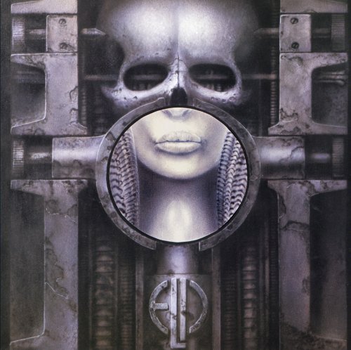
Yetizone's mention of Gieger brought this favourite to mind.As with many albums from the prog rock genre album artwork ( and posters and inserts ) was an integral part of the package.IMO this was true in this instance as it seemed to fit very well with the Karn Evil 9 suite that took up the bulk of the album.Tarkus wasn't bad either.
Tobyjug - my apologies, I mistakenly thought it was Kevin-W who started the thread as he'd posted a few examples!
 Happened to me once in Blackpool...????????
Dan Steel posted:
Are you Daniel, or Danielle?
The perils of chewing/bubble gum! I nearly posted that one - the great thing in the picture is the girl’s completely unemotive face...
Innocent Bystander posted:Dan Steel posted:
Are you Daniel, or Danielle?
The perils of chewing/bubble gum! I nearly posted that one - the great thing in the picture is the girl’s completely unemotive face...
Take your pick????